 |
| RayGun magazine cover |
Carson’s method is to design every page from scratch, reading the magazine article and trying to make sure that the content is interpreted in the page design. He believes that over-reliance on a grid can lead to laziness, as designers accept the pre-formatted settings in their software and produce bland layouts.
“I can’t work with any kind of guidelines on the computer – the first thing I do is eliminate them… I never learned what a grid was… and didn’t see a place for them in my work.”
David Carson
 |
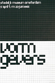
| Vormgivers exhibition poster |
Modernist typographer Wim Crouwel sits at the opposite end of the design spectrum. The grid methodology has underpinned his work for the last half century and still makes sense to him today.
Wim’s working method relies on a rigorous hierarchical analysis of text and image. This structured approach to the relative positioning of elements on the page inevitably led to his use of a grid as the primary method of arranging content, and for providing the reader with access to it.
“I was called “gridnik” because all the time I was talking about grids and giving lectures about them.”
Wim Crouwel
Two great designers, two different approaches.
Personally, I love using grids. The point of them is to provide a structure within which a designer or typographer, sometimes working in a collaborative team, can arrange content.
It provides a rational basis on which a set of recognisable typographic conventions can be arranged, creating a consistent pattern that allows the reader to navigate content with clarity.
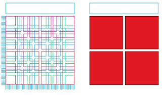
As a device, the grid can be as simple as a single page-sized cell, or as complex as Karl Gerstner’s ‘perfect’ 58-unit grid for Capital.
 |
| Karl Gerstner's 58-unit grid |
Where the content is continuous text, a simple single column structure is all that is required, but in a more complex magazine format, a grid structure with the flexibility to accommodate more complex and varied material will be needed.
The starting point for both types of grid is the content type and the choice of typeface, size and leading. The logic of the grid structure can then be developed in relation to the format.
Creating a grid
Geometry and mathematics are, broadly speaking, the two approaches to creating a grid.
Geometrical grids are based on the golden section (1:1.618), a ratio of width to height. This approach is typically seen in book publishing.
Mathematical (or modular) grids are based entirely on the logic of the page and type size. This approach is one of the characteristics of the International Typographic (Swiss School) style of design.
The golden section
Traditional book page design works with a pair of facing pages with margins and content arranged according to the golden section (1:1.618). The geometry of the page requires no calculations, the positioning of elements being derived from the size and shape of the pages themselves. This approach works well for single or double columns of type, but is less successful for more complex layouts.
Fibonacci sequence
An alternative geometrical approach is to use the Fibonacci sequence of numbers to establish margins. The relative proportions are inner margins of 3 units, top and outer margins of 5 units and a bottom margin of 8 units.
Width to height ratio (‘A’ sizes)
The ISO ‘A’ series of paper uses a ratio based on a series of root two rectangles, where each rectangle has the same width to height ratio if halved. The starting point is the A0 size of paper, with each subdivision exactly half the size of the previous size.
Modular grid
A modern basic grid subdivides the page into a number of smaller fields or modules. Vertically the page is split into margins and columns, generally measured in millimetres, whilst horizontally the page is divided by the baseline grid, measured in points or millimetres. The text baseline grid combined with the number of columns on the page determines the size and shape of the modules in the grid.
The choice of grid methodology to use depends on the nature of your project, the type of content and your own working methods.
“The grid system is an aid, not a guarantee. It permits a number of possible uses and each designer can look for a solution appropriate to his personal style. But one must learn how to use the grid; it is an art that requires practice.”
Josef Müller-Brockmann
More terrific grid-centric articles can be found at The Grid System, an ever-growing resource where graphic designers can learn about grid systems, the golden ratio and baseline grids.