Showing posts with label Typography. Show all posts

Tuesday, 24 October 2017

Jost Hochuli: In Conversation


Jost Hochuli
Jost Hochuli, the renowned book designer, graphic designer, typographer, printer and author of Designing Books, and Detail in Typography has had a slow but steady impact on modern book design and typography. First, through his work, especially that for VGS and Typotron; then through his teaching at the Schüle für Gestaltung in St. Gallen; and more widely through his publications on typography and book design.

Through these books, especially the English language edition of Designing Books, he has become probably the most influential theorist of book design since Jan Tschichold.

Jost’s belief is that book design is not just concerned with beautiful objects, but rather it is about making useful tools for reading.

Apprenticed to Rudolf Hostettler at Zollikofer Verlag (publishing company) in the 1950’s, anecdotally only two typefaces were permitted in the works – Akzidenz Grotesk and Times New Roman. Working in the modernist style known as Swiss or International school, the goal of the apprentice typographer was to simplify page design and layout so that there was no typographic ‘noise’.

Although we think of the Swiss school as being the dominant style in Europe in the fifties and sixties, in fact it was largely confined to Holland, Germany and the German-speaking part of Switzerland. Even within Switzerland, designers in the French-speaking cantons looked to France and Didot, designers in the Italian-speaking cantons to Milan and Bodoni.

Nevertheless, the Swiss school, following the path laid down by the Bauhaus architect, industrial designer and typographer Max Bill won worldwide recognition in the decades following the Second World War

“We were simply louder” said Hochuli.

Bill urged Swiss designers to follow modernist “‘asymmetric’ or organically formed typography”, to reject “the conventional text-image of axial symmetry”.

In response, contemporary designer Jan Tschichold defended the need to design some books “in the manner of traditional typography” while allowing that others might be more suitable done in Bill’s ‘functional’ typography.


As Hochuli developed his style, he was influenced by Tschichold’s plea for “the right to work in the way that I find best”, whether ‘newly revived traditional typography’ or ‘functional typography’.

Although Tschichold never visited the Zollikofer works, Hostettler considering him “A traitor to modernism”, Hochuli followed a middle path between the modernism of the Bauhaus and die neue typographie and traditional book design, before ultimately rejecting the rigidity of the grid.


Preferring to use consistent channels of white space between elements to create harmony on the page, Hochuli’s graphic design practice aimed to capture the feeling of the work through typographic layout that created “adventures on a page”.

Thus echoing the principle ‘form follows function’, Hochuli’s preference is for content to come before design, although, as Hochuli has reiterated on several occasions, the designer must not follow dogma.

--

Jost Hochuli was in conversation with Tony Pritchard, LCC senior lecturer and ISTD board member.

In association with International Society of Typographic Designers, London College of Communication, Presence Switzerland and the Swiss Cultural Fund.


Saturday, 19 November 2016

Type talks

We know that typefaces convey emotion as well as information.

Sarah Hyndman’s talk at the Museum of Packaging set out to explore the connections between social change, popular sentiment and typography.

In a time of increased industrialisation and globalisation, where jobs and livelihoods are threatened, where an influx of labour from elsewhere depresses wages, where old certainties are stripped away as financial systems, social order, and country borders are threatened. New leaders articulate a radical vision of the future, whilst those outside of the elite look on powerless and in search of a voice.

Sound familiar?

In 1970 the raw anger of a generation that felt excluded, marginalised and ignored found their voice in Punk. Expressed through attitude, music, style and typography, Punk’s anti-establishment stance found its visual expression through the work of Jamie Reid.

The stylistic conventions of Punk included mixing type styles and weights, overprinting, cluttered pages, deliberate mistakes, cultural references, blurred photography and an embrace of general messiness. All elements that rejected the rules and structure of the international style, took the typographic grids of modernism, a visual shorthand for the corporate industrial complex, and tore them apart.

Treating type as if it was a photograph freed designers from the restrictions of typesetting within a structured grid. Cut-out, photocopied and hand-drawn type also had the advantage of being able to bypass expensive printers, the rawness of the layouts on labels, flyers and zines perfectly matching the urgency and language of the authors.

 Ironically, the vibrancy of the look led to it becoming co-opted by the very establishment that Punk aimed to subvert. First ignored and feared, then embraced and tamed.

Kellog’s Squares anyone?

The creation of an expressive style that symbolises opposition to the establishment has historical precedent, and the inevitable co-option of anti-establishment typography into the mainstream follows a similar pattern. First World War Germany saw the appearance of Dadism. 1960’s America brought us psychedelia and pop art against the backdrop of the Vietnam war. The industrial decline of The UK in the 1970’s gave rise to Punk, whilst the 1980’s brought New wave and the postmodern typographic design of Brody, Saville, 8vo and Tomato (amongst others).

And so to 2016, and the rise of the Snapchat generation. With one typeface, limited tools and only a 10 second viewing window, Snapchat is the latest medium for millennials to share the moments that matter to them. it’s really immediate and ugly. You’re not designing, it’s just Times New Roman or Ariel and then it’s gone. It’s the closest thing now to how Punk looked like then.

Unstructured information and emotion that is explicitly short-lived and self-deleting, so it can’t be filtered, searched, indexed or saved, but provides today's authentic voice.

Thursday, 13 October 2016

Noto

Photo: Andy Dunn
Noto, Google’s multi-language font family from Monotype is designed to work over a wide range of different languages and on any device.
 

Noto covers more than 800 languages and 100 written scripts, and includes serif and sans serif fonts across eight weights as well as numbers, emoji, symbols, and musical notation.
 

The result of a five-year collaboration between Google and Monotype, one of the main aims for the typeface is to allow cultures to communicate digitally and help enable global communications across borders, languages and cultures.
 

Monotype has researched and digitally designed the characters, writing systems and alphabets for each Noto typeface, applying the rules and idiosyncrasies for individual languages to the fonts, based on the Unicode standard – a character coding system that defines the characters and languages that can be displayed and used within a computer system.
 

Because new scripts are constantly being added to Unicode, when a computer is unable to display a character in a font, it displays blank boxes instead. These are colloquially known as “tofu”. The name Noto is taken from Google’s goal of having “no more tofu”.

Monotype linguistic typographer Kamal Mansour says: “The aim of the Noto project is to provide digital representation to all the scripts in the Unicode Standard. That in particular is something that many different language communities could not afford to do on their own.”

Monday, 22 September 2014

Big design

gov.uk
When the award-winning gov.uk site launched in 2012, it marked the moment ‘big design’ entered the mainstream.

Driven partly by the need to be accessible, and partly by the requirement to work on mobile devices, the launch of gov.uk also coincided with the design industry moving from skeuomorphic design towards the flat aesthetic seen in Microsoft’s Windows 8 ‘Metro’ interface, Apples iOS8 and Google’s Materials Design.

This combination of HTML5 dynamic backgrounds, overlayed with large type and control icons on flat colour panels has created a youthful ‘flat’ UI design meme that references the Bauhaus and Swiss Design schools and provides a single underlying system providing a unified experience across platforms and device sizes.

The new BBC responsive website, now in beta testing, follows the same principles.


BBC Beta

Every week, the BBC News website gets around 115 million visits, and the number coming from mobiles and tablets is increasing all the time to the point that these devices now account for 43% of unique browsers.

Looking at device usage, it seems clear that the increased take up of tablet and mobile devices, with their requirement for larger button target areas, is driving the move towards ‘big design’.


Apple iOS7
For any organisation, maintaining different versions of websites for desktop, tablet and mobile (as well as accounting for different screen sizes, different browsers and legacy systems) is unsustainable. Designing simpler responsive sites, optimised for different screen sizes, is the most efficient structure, but it means that control areas designed for display on mobile devices take up a proportionally larger area of screen when displayed on a desktop device.


Microsoft Metro/Windows8
Google Material Design
This also represents a shift in the way websites are designed. In the early days of the web, websites were merely ‘brochureware’ extensions of printed publications. (The first web page I designed for the DTI just had a telephone number on it.) Then came sites that replicated the (sometimes labyrinthine) internal structure of an organisation. In the third wave these sites were turned around to be more user-centric.

Now we are seeing the rise of more focused task-centric sites, and enabling users to carry out these tasks (often on the move) using a simple graphic UI that stands out from the background visual noise is a major driver in big design.

But in deploying large blocks within your content, the challenge now for a designer is how to develop the visual structure without losing a sense of style.

The resolution of mobile screens means that good typography, tracked and spaced with as much precision as print, is now achievable. Icons and other UI elements don’t need candy stripes or glossy reflections to make them look better at low resolutions.

So while it’s good to know what best-practice is, it’s possible for designers to push the boundaries, because we can.


Tuesday, 5 November 2013

Less than one second


Paul Butt / Section Design
Structuring and visualising data is a discipline that always appeals to me, so it was with a sense of anticipation that I took a trip to Shoreditch to see a two-day exhibiton of information and data design curated by London based information design agency, Signal Noise.

Signal Noise commissioned a series of print-based data visualisations that explored the theme of “less than one second”, based on the premise that time is of the essence now more than ever before.

We now access enormous reams of data in ‘less than a second’, thanks to technologies such as cameras that captures the movement of light in slow motion, or the Large Hadron Collider (LHC) that observes sub-atomic activity happening in millionths of a second.

Technology enables a vast number of data points and events to be read and understood across a variety of fields - from automated trades to F1 analytics - but filtering and making sense of the data so that it provides a useful insight is the job of the information graphic designer.

Despite the wide range of subjects used as source material for the exhibition, including athletics, cinematography, F1, GPS, the LHC and stock trading, I found it significant that the base structure of the majority of the visualisations was circular.


Mapping the data - Josh Gowen
The visualisations that eschewed circles were, I thought, less intuitive and less visually attractive, even though timelines are traditionally depicted as, well, a line.

Imposing a clock face metaphor seemed to provide a familiar ‘carrier’ structure for the message, enabling the viewer to quickly interpret the information.

The most successful visualisation seemed to me to be Josh Gowen’s ‘Mapping the data’, combining the clock metaphor with the shape of the LHC and a graphic that showed how the volume of data crunched by the LHC is filtered and then delivered to 151 research centres worldwide.

Telling the story by combining seven pieces of information in one graphic, plus some cool stats. What's not to like?

Thursday, 26 September 2013

Unbuntu open source font project

Following on from Bruno Maag's presentation on fonts and branding, I wanted to find out more about Dalton Maag's Unbuntu* open source font project.

Unbuntu is a free to use open source operating system developed by Canonical.  What sets Unbuntu apart from other open source projects is the aim of creating for the user a friendly and consistent experience from code to graphical user interface (GUI) to print.

Part of Canonical’s design philosophy is to ensure that users can use programs in their own language, so the font used for the operating system (OS) needed to work across a range of character sets including Arabic, Cyrillic, Greek, Hebrew and Latin and is designed so it can be extended to include other languages including Chinese, Indian and Thai.

Establishing the nature of a font requires a structured design framework to inform each stage. The difference with this project was the involvement of the Open Source community throughout – essential to influence the process and confer a sense of ownership. The design process had to be completely transparent with a flow of information in both directions.

As a core part of the Unbuntu brand identity, the new typeface needed to embody the Unbuntu values of clarity, lightness and simplicity, so early in the design process Dalton Maag established that a humanist sans serif was the most appropriate look and feel for the font.

This decision was in part dictated by the required functionality of the OS; the need for the font to work on screen at small sizes meant avoiding anything too elaborate or too wide.

Humanist fonts have their roots in early round hand calligraphy, and are seen as friendly, warm and highly legible. The clean lines and large x-height of a sans serif help with on screen readability, print well and have a contemporary feel.

The initial concepts were designed using a small number of glyphs, but enough to be able to create test copy, and get a good idea of what the finished design would look and feel like. Beginning with the Latin, Dalton Maag started designing with the four letters, n o H O, and these glyphs helped to define a guide for around 80 percent of the remaining character set.  The distinctive shapes for the ‘n’ and ‘v’ and a slight curvature to the ascenders and descenders helped establish the overall personality of the font. These unique design features would be translated across all the character sets to ensure that the design was a complete and consistent family.

The final font design includes four weights from light to bold plus their italics, a monospace font and a condensed regular.

The italic versions were designed as true italics where the a,e,f and g have different shapes that add subtle emphasis and textural difference to the roman text.

The designers also needed to consider the spacing between letters, as this creates a natural rhythm in the text that helps the reader to read with ease and understand the message. Manual adjustments, including kerning pairs, were addressed to ensure that the finished look was aesthetically pleasing.
Cultural sensitivities and nuances also needed to be taken into account for the left to right reading Arabic and Hebrew fonts. Arabic glyphs are derived from one another, but change meaning with the addition of diacritics, whilst Hebrew letterforms have a squarer feel and ‘hang’ from the x-height rather then sitting on the baseline.

Dalton Maag’s engineering team then performed a complex process to ensure that the font rendered on screen correctly. This included a checking and verification process to make sure that it met TrueType specifications, the addition of Unicode system information to identify each glyph co-ordinated across all the font styles and weights, and extensive manual hinting to make the font appear faithfully at any resolution on any device.

Finally the fonts were tested in a number of different environments and applications to check that they behaved as intended before being released.

The final design is a beautiful example of typographic design. It gives shape to the Open Source philosophy of Ubuntu, whilst remaining functional and aesthetically pleasing.

Exhibited in the Design Museum, the Unbuntu font family is a practical example of how a the partnership between the Open Source community and professional type designers can use the power of design to produce something valuable for everyone to use.


*Unbuntu is named after the Southern African philosophy of ubuntu, which often is translated as “humanity towards others” or “the belief in a universal bond of sharing that connects all humanity”.

Thursday, 19 September 2013

‘I love Comic Sans’


And so to hear Bruno Maag speak at London Design Week’s Sound and Type lecture in the glamorous environs of the Soho Hotel Screening Room.

His opening statement, that he ‘loves Comic Sans’, drew a predictable hiss of outrage from the designers and typographers in audience, but the point Bruno made is that Comic Sans is completely appropriate for its original purpose, comic book style lettering for speech bubbles in the programs MS Bob and MovieMaker

Comic Sans has a characterful letterform that connects, perfect for supporting letter recognition in early learning (and useful for dyslexics too).

So how do you engage audiences visually and emotionally with your brand? What are the essential elements that make your brand unique? How do you create bespoke tools that set your brand apart?

The challenge presented to branding in the global marketplace is maintaining the brand look and feel across all touchpoints in all markets.

Think ‘international’, and designers reach for their tried and trusted sans serifs, but where’s the emotional connection in the international style?

Remember that the ‘modern’ typeface Helvetica was cut in the 1950’s (itself based on the grotesque faces of the late Victorian 1900’s), putting Helvetica well into middle-age.

Instead, make an informed choice of typeface, one that expresses your brand values and connects visually and emotionally with your audience, a typeface that can be placed right at the heart of your brand.

Global companies, such as HP, see investment in a bespoke typeface as a key part of supporting their brand experience worldwide.

But relying on the Western European character set no longer cuts it. Fonts need to accommodate Arabic, Chinese, Cyrillic, Greek, Indian and Thai characters.

Designing a font for the Chinese market means creating 27,500 glyphs alone and can take up to two years.

And that’s before you take into account Hong Kong and Taiwanese Chinese.

Font design is a major investment, but the recognition value that an appropriate font brings to a brand makes it arguably worthwhile.

Just don’t use Comic Sans unless you’re designing a comic.

Thursday, 13 October 2011

Stylesheets

One of the recurring issues I’ve had when designing a document is the inability of people to use stylesheets to structure their content.

I’m no longer surprised at the number of clients who cannot, or will not, use stylesheets in Word (“I haven’t got the time to learn all that – can’t you do it for me”), but I continue to be amazed at the number of designers who cannot, or will not, use stylesheets in InDesign/Quark Xpress (‘It cramps my creativity – can’t the setters sort it out”).

I was reminded of this during a recent software presentation that promised to map Word documents into InDesign and then automatically output to print, PDF, web, tablet and mobile. The software used a combination of Extensible Markup Language (XML) and application/device stylesheets, and I have to admit it was pretty fast.

The problem was, that for the system to work effectively, the content in the original (Word) document needed to be structured in the first place – and without that, the mapping software could not map.

(Of course InDesign already has a built in XML tagging option that enables tagged content to be manually repurposed in another file or application. Similarly, you can import an XML file into InDesign and instruct InDesign to display and format the XML data in any way you want.)

To get the benefit of ‘design once, publish many times’, you need to be able to separate the visual style from the document structure – a principle that will be familiar to you if you are used to using Cascading Style Sheets (CSS) in web design.

The same principle holds true for traditional print publishing, and now that Word 11 has improved the way styles work, including adding a ‘Show Styles’ option that interprets levels of heading (even if an outline heading level has not been specified), there really is no excuse for not structuring documents properly.

Doing this at the beginning of the process means that Word styles can be mapped to InDesign styles using tags, and in the same way, tags can be carried across into Acrobat for creating accessible PDFs or HTML for use online on tablet or other mobile devices.

The whole point of technology is that you use it to make your workflow more efficient, leaving you more time to design.

Better, faster, cheaper.

That’s the future.

Tuesday, 6 September 2011

Grids

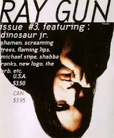
RayGun magazine cover
David Carson is renowned for his intuitive approach to magazine design. Working on the niche magazines Surfer, Beach Culture and later music magazine RayGun, his design work mixed raw images and type for a young, iconoclastic and visually aware audience that had the passion to put effort into reading his layouts.

Carson’s method is to design every page from scratch, reading the magazine article and trying to make sure that the content is interpreted in the page design. He believes that over-reliance on a grid can lead to laziness, as designers accept the pre-formatted settings in their software and produce bland layouts.

“I can’t work with any kind of guidelines on the computer – the first thing I do is eliminate them… I never learned what a grid was… and didn’t see a place for them in my work.”
David Carson
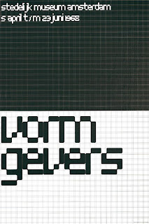
Vormgivers exhibition poster

Modernist typographer Wim Crouwel sits at the opposite end of the design spectrum. The grid methodology has underpinned his work for the last half century and still makes sense to him today.

Wim’s working method relies on a rigorous hierarchical analysis of text and image. This structured approach to the relative positioning of elements on the page inevitably led to his use of a grid as the primary method of arranging content, and for providing the reader with access to it.

“I was called “gridnik” because all the time I was talking about grids and giving lectures about them.”
Wim Crouwel

Two great designers, two different approaches.

Personally, I love using grids. The point of them is to provide a structure within which a designer or typographer, sometimes working in a collaborative team, can arrange content.

It provides a rational basis on which a set of recognisable typographic conventions can be arranged, creating a consistent pattern that allows the reader to navigate content with clarity.

As a device, the grid can be as simple as a single page-sized cell, or as complex as Karl Gerstner’s ‘perfect’ 58-unit grid for Capital.
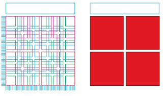
Karl Gerstner's 58-unit grid

Where the content is continuous text, a simple single column structure is all that is required, but in a more complex magazine format, a grid structure with the flexibility to accommodate more complex and varied material will be needed.

The starting point for both types of grid is the content type and the choice of typeface, size and leading. The logic of the grid structure can then be developed in relation to the format.

Creating a grid
Geometry and mathematics are, broadly speaking, the two approaches to creating a grid.

Geometrical grids are based on the golden section (1:1.618), a ratio of width to height. This approach is typically seen in book publishing.

Mathematical (or modular) grids are based entirely on the logic of the page and type size. This approach is one of the characteristics of the International Typographic (Swiss School) style of design.

The golden section
Traditional book page design works with a pair of facing pages with margins and content arranged according to the golden section (1:1.618). The geometry of the page requires no calculations, the positioning of elements being derived from the size and shape of the pages themselves. This approach works well for single or double columns of type, but is less successful for more complex layouts.

Fibonacci sequence
An alternative geometrical approach is to use the Fibonacci sequence of numbers to establish margins. The relative proportions are inner margins of 3 units, top and outer margins of 5 units and a bottom margin of 8 units.

Width to height ratio (‘A’ sizes)
The ISO ‘A’ series of paper uses a ratio based on a series of root two rectangles, where each rectangle has the same width to height ratio if halved. The starting point is the A0 size of paper, with each subdivision exactly half the size of the previous size.

Modular grid
A modern basic grid subdivides the page into a number of smaller fields or modules. Vertically the page is split into margins and columns, generally measured in millimetres, whilst horizontally the page is divided by the baseline grid, measured in points or millimetres. The text baseline grid combined with the number of columns on the page determines the size and shape of the modules in the grid.

The choice of grid methodology to use depends on the nature of your project, the type of content and your own working methods.

“The grid system is an aid, not a guarantee. It permits a number of possible uses and each designer can look for a solution appropriate to his personal style. But one must learn how to use the grid; it is an art that requires practice.”
Josef Müller-Brockmann

More terrific grid-centric articles can be found at The Grid System, an ever-growing resource where graphic designers can learn about grid systems, the golden ratio and baseline grids.

Tuesday, 19 July 2011

Type readability

The ability to read quickly and to understand what is being read depends on good typographic design reducing the effort required to comprehend the text. (It also requires good writing and copyediting, but that’s for another post.)

For readability, the choice of typeface, upper and lower case (U&lc), typesize, leading, line length, margins and paper colour and all need to be combined to produce readable copy.

For instance, most books are set using a serif font rather than sans-serif, because the serifs help the reader’s eye to rapidly scan along the lines of type on a page. This gives U&lc serif faces a high readability factor for longer passages of text.

Whilst sans-serif faces generally have a relatively low readability factor when set to longer line lengths, they have high readability factor on signage and when set in shorter line lengths. Sans-serif offers a sense of urgency, enabling the reader to scan quickly down the copy and assimilate information – a more appropriate reading experience for signs and magazines.

Common text type sizes tend to be between 9 and 12 point (depending on font) with leading set automatically by design software at around 120% of the typesize. This should always be adjusted by the designer with an appropriate amount of leading determined by the design. As a rule of thumb, for normal text, leading should be increased proportionally until around 14 point, when it should be decreased proportionally until around 18 point, after which it should be set solid (ie. 18/18pt). With larger type sizes and headlines, the leading should be further reduced to avoid creating too much space between lines.

In typesetting for legibility, the leading should never be less than the spacing between words, otherwise the readers eye is drawn down rather than across the page. However headline setting can often be set solid, or even to a minus value, without affecting readability. For longer measures, the leading might also be increased so it provides stronger definition to the line of text. As a rule of thumb, the longer the line, the greater the leading required.

In English, the line length normally contains between 50 and 80 characters for readability, resulting in an average of nine to 12 words per line. Scientific and technical papers, which are likely to contain longer words, tend to need a longer measure.

Finally, the margins around the type should allow enough white space to allow the reader’s eye to rest momentarily until it scans back to the start of the next line.

Note that glossy white paper, whilst great for images, makes text difficult to read.

So, so as long as you print on a matt paper stock, readability is governed by the designers ability to structure typeface, case, size, leading, line length and margins into a compelling design.

Tuesday, 5 July 2011

Legibility and readability

Legible type and readable type seem like synonyms, but typographically they are not the same thing.

Legibility refers to the recognition of individual letters and words, whilst readability is the clarity and speed at which content can be read and understood.

The legibility of a typeface is dependent on its design (and perversely some typefaces are deliberately designed to be illegible), whilst readability depends on the skill of the typographer in choosing a typeface and arranging the type well on the page.

One of the more common mistakes designers make is to choose a typeface designed for one purpose and use it for something else for which it is unsuitable. A classic example is the use of the display face Avant Garde as a text font. Equally, you would not use a difficult to read brush script for a fire exit sign where the meaning needs to be read and decoded quickly.

Since the introduction of the Disability Discrimination Act in the UK in 1995 and the Disability and Equality Act in 2010, typographic design needs to be inclusive of people with a wide range of visual impairments. Making sure that your type is structured to be legible and readable was always a hallmark of good design, but now it is a prerequisite.

In the next two posts I'm going to look at little deeper into some of the issues around the legibility and readability of type.

Thursday, 28 April 2011

Wim Crouwel at the Design Museum

If you get the chance, take an afternoon out to visit the Design Museum where the Wim Crouwel retrospective is showing until July.

Regarded as one of the leading designers of the twentieth century, Crouwel embraced modernist principles, producing a wide range of typographic designs that influenced the course of graphic design through the 50s and 60s and continues to have resonance today.

Heavily influenced by the Bauhaus and the modernist design work of Jan Tischold and Josef Muller-Brockmann, Crouwel’s initial work as an exhibition designer gave him a great sense of spatial awareness that he brought to his poster and programme designs, first for the Van Abbe Museum in Eindhoven, and later for the Stedelijk Museum in Amsterdam.

Wim Crouwel's work at the Design Museum
Gifted with a sympathetic museum director who allowed him the freedom to develop a signature look, Crouwel developed a structured grid system which acted as a unique template for the Stedelijk Museum's graphic identity. The logic of his designs distil the subject down to its absolute essence, yet often the poster layouts contain an experimental element or visual pun, playing off the exhibition title or the subject artist's style.

In 1963 Crouwel founded the multi-disciplinary design agency Total Design creating the identity for numerous Dutch companies, working for clients such as IBM, and typeface commissions for Olivetti. He was instrumental in leading a controversial redesign of the dutch telephone book using only lowercase letters - offering major savings on ink and paper - but one which failed to find favour with its audience.

New Alphabet (redrawn)
Whereas his strength lay in designing one-off grid-based posters and wordmarks, primarily supported by easily readable sans serif type, his interest in letterforms as graphic objects led Crouwel to design the radical New Alphabet typeface as a visual experiment. Based on the look of type as seen in emerging computer systems, it appeared almost alien, a cipher script of vertical and horizontal lines. This almost Illegible font challenged the design establishment and provoked debate amongst modernists - a debate which Crouwel was happy to engage in - openly admitting to placing visual aesthetics above function.

(Although never meant to be really used, New Alphabet was subsequently redrawn by Brett Wickens and Peter Saville for the Joy Division album, ‘Substance’ in the late 80s.)

Some of his work has dated, but there are many pieces that still retain a freshness and vitality and demonstrate a clarity of thought. Set beside contemporary work by design groups 8vo, Cartlidge Levine, Studio Myerscough and Peter Saville, the influence and legacy of Wim Crouwel can be clearly seen.

Tuesday, 11 January 2011

Perception I (difference)

In a previous post, I talked about how designers transmit knowledge, share concepts and process information through language, and how structure and legibility affect the visualisation of messages and inform the design decisions you make on a daily basis.

To help your audience understand your messaging, you need to know how they will receive and decode the information you send.

Scientific study has provided designers with a number of theoretical tools to refine and improve their messages. Among these, some of the more practical tools are chunking, perception, scanpaths, wayfinding and content structure.

In perception, there are two key structures involved, difference and discernment.

Difference threshold and Weber’s Law
Understanding our ability to perceive information and distinguish one information set over another can help designers target their messages for maximum impact.

Weber’s Law of Just Noticeable Differences (no, really!) suggests that there is an identifiable minimum amount of change that can be defined for a viewer so that they are able to notice a difference in any one design

If the amount of perceptual change remains a constant (and can thus be predicted unconsciously by the viewer), then it is easier for your audience to process and distinguish between different types of information. This regular rate of change is known as the ‘difference threshold’.

Weber’s Law can be used to help designers make constructive choices in making information follow an obvious hierarchy.

For example, setting a consistent rule for the differential sizing of type headings, say in 4 point increments, establishes a clear information hierarchy in the mind of the audience.

Similarly, decisions on the relative weights of fonts in typeface design can also be informed by identifying the difference threshold.

User testing of visual assumptions against Weber’s Law can help confirm the designer’s intuition regarding aesthetic considerations and help establish clearer communication with the audience.

Thursday, 9 December 2010

Science Museum Brand and Identity

© Johnson Banks
I'm very excited by the new Science Museum brand and identity from Johnson Banks currently being rolled out throughout the museum.

'The chosen idea stemmed from research (Johnson Banks) did on codes, puzzles, patterns and basic digital typefaces, and we found a way to shorten the word science so we could create a grid-like ‘stack’ of the letterforms.'

The posters on the London Underground look great, with the distinctive typography (Font: SM Grid from The Foundry) standing out from the visual clutter around them.

Great idea, great structure, great execution.

Wednesday, 10 November 2010

FAC numbers

Image: Jan Chlebik
The unveiling in Manchester the late Tony Wilson's gravestone, designed by long time Factory Records collaborator Peter Saville and Ben Kelly, was notable not only for being three years late, but also for being the only Factory 'production' not given a FAC number.

Factory Records employed a unique cataloguing system that gave a number not just to its musical releases, but to artwork and other objects (including a lawsuit).

The last ever Factory catalogue number was given to Tony Wilson's coffin (FAC 501).

I like the way that a simple identifier took on a whole life of it's own and became as much a part of the Factory brand language as the imagery and type.

For type enthusiasts, the font is Rotis and was laser-etched.