Creating structure is one of the key tasks for designers, but if we are creators of structure, what sort of structures are we creating?
Architecture influences the way we move through physical space. We create places for reflection and zones for action within perceptual boundaries and physical constraints.
Information architecture performs the same function, creating virtual spaces – patterns - whose purpose is communicated through space, form, colour, image, typography and behaviour.
These structures define entrances and exits to spaces where we engage in actions in both real and virtual worlds. Well-designed spaces and declare their purpose and encourage us to interact, to perform and to create.
The visual structure we build into our designs affects the way people see them. Is our visual hierarchy working so that readers find what they need, and in the right order? Are elements appropriated weighted so that their relationships are clear? Do people gravitate toward the most important information on the page, or are there elements that distract? Can our audience clearly see what to do next?
We begin to nudge the user experience by developing a conceptual structure that describes a consistent visual language. Our primary goal must be clarity. Does this graphic help to illustrate the idea, or make it more confusing? Communicating through words and images influences the way we think about things, and over time, becomes part of our brand.
Social structures influence the way we interact with others and set out the opportunities for social interaction. This area is one that designers have only just begun to investigate. Can you poke people? Favorite something they did? Engage with a brand? How is reputation managed? Are you able to import or export your relationships, and (more importantly) does it make sense to do so?
Of course these structures do not function in isolation. They overlap, intermingle, and co-exist. As designers we need to recognise the most appropriate patterns, and how to use them in our designs.
Build well.
Showing posts with label Cognition. Show all posts
Showing posts with label Cognition. Show all posts
Tuesday, 23 December 2014
Thursday, 20 November 2014
Design by algorithm
Logos that change based on external variables
The tension between the desire for uniformity and the need for originality has provided a rich seam for branding agencies to exploit.The idea that the essence of visual design can be expressed via a universal set of rules has a rich history, from the greek golden section via vetruvian man, compositional techniques, and the typographic grids of modernist typography.
But whilst brands can be monolithic or flexible, their visual expressions remained fixed until the 1980’s when the introduction of desktop publishing made it possible to produce designs that change based on external variables.
Some brands might need to show diversity of service or product, while others see flexibility as a crucial competitive advantage. So for those organisations that have evolution written into their essence, a dynamic identity provides an exciting and relevant structure for brand expression.
 |
| NAI |
Less successful was Abbey National’s 2003 ‘soft and fuzzy’ rebrand, ditched when Santander acquired the bank, but Wolff Olins returned to the idea of flexible brands, with a more controlled iteration in PWC’s device-friendly identity where a set of translucent rectangles flex and change depending on their usage.
 |
| PWC's flexible branding |
Now, the use of the algorithm has enabled the rise of tailored design, where application of a consistent set of rules to a dynamic data set produces a unique output - design expressed as art.
A recent example of this genre is MIT Media Lab’s development of its flexible identity. Created by Pentagram, and based on the same grid as its predecessor, its aggressive pixelated letterforms create an uncompromising set of marks with echoes of Wim Crouwel’s New Alphabet.
It’s not a beautiful logo, but as the visual expression of the Media Lab’s multiple research groups at the core of its academic structure, it fits.
 |
| Lockups of two characters within the grid allow for almost every possible letter combination— “an algorithm” explains Pentagram, “will generate all the possible solutions for any given group acronyms in the future.” |
This visual language sets the tone for a highly flexible range of applications and future permutations of the identity that will have the same look and feel without having to be the same.
In a more sensitive use of the pixel-block style, Norwegian design studio, Snøhetta, has designed the obverse of Norges Bank new bank notes. The design, based on the boundary where sea, shore and sky met, renders images from the Norwegian coastal landscape in a Minecraft-like pixellated form, the degree of distortion related to the ‘windspeed’ that increases with each denomination.
 |
| On the 50 kroner note the wind is weak, so the boundary between sea and coast is rendered in calmer short, square shapes; while on the 1,000 kroner note the wind is strong, creating longer, stretched-out forms that allude to rolling breakers and windswept trees. |
But whilst Snøhetta uses the idea of windspeed to create the pixel distortion, the execution is static. A 2010 scheme for Nordkyn from Oslo’s Neue Design Studio, also using data based on the feed from the Norwegian Meteorological Office, produces a new logo dynamically for every application.

 |
| http://horizons.dandad.org/ |
Where an entry lacks a suitable data feed to produce dynamic data, use of a picker to sample random colours from an image can provide the necessary random variable.
 |
| ITV colour picker |
As well as colour, shape can have an influence. Sagmeister’s identity for Casa Da Musica needed to echo the exuberance of the architecture because ‘as we studied the structure, we realized that the building itself is a logo’.
 |
| Casa Da Musica dynamic logos |
Sound can also be used as the dynamic element.
Precedent’s work for the Leeds College of Music, using a tool created by Karsten Schmidt, allows staff and students to create their own visual identity by inputting visualisations of their own music to create their own unique sound signatures to use in graphic applications.

But because many audiences will only see a single iteration of a dynamic identity system, it follows that if any individual variant is weak, the overall identity suffers. For the overall brand to be successful, the pieces need to equal the whole.
So the key question to ask of any dynamic identity is whether it accurately expresses the brand in all its executions.

Thursday, 17 April 2014
Heartbleed

You’ve probably never heard of CVE-2014-0160. But you probably have heard of the Heartbleed bug, the security hole in some implementations of the OpenSSL protocol that provides secure communication between servers.
The two are one and the same, except that CVE-2014-0160 is the name assigned under the Standard for Information Security Vulnerability Names protocol, wheras Heartbleed is a catchy, scary name with a catchy, scary logo depicting a red heart. Bleeding.
The power of the Heartbleed logo is in its sheer, bold literalness, and in that regard it’s perfect for its purpose.
Heartbleed was given its identity by the international security company Codenomicon, which independently discovered the CVE-2014-0160 OpenSSL exploit on the same day as Google researcher Neel Mehta.
Most security holes like CVE-2014-0160 would be posted on messageboards read only by the coding and hacking community, but in this case Heartbleed was so serious that everyone who uses OpenSSL in applications such as web, email and instant messaging was at potential risk of having their passwords compromised.
A Codenomicon engineer came up with the name Heartbleed, inspired by a tangentially related piece of software called Heartbeat, and in a brilliantly inspired piece of marketing, Codenomicon registered Heartbleed.com, designed an FAQ explaining the bug, and accompanied it with a logo by Codenomicon designer Leena Snidate.
The logo went viral and the Heartbleed brand was born.
Don’t be surprised if the next major bug also gets its own name and logo™ and probably a clothing range.
Wednesday, 17 October 2012
The Big Draw 2012
At the V&A for The Big Draw, I attended one of the seminars given by Heatherwick Studios.
The main theme was about the importance of sketching in order to structure your design thinking.
Quick sketches made with your client on site are a great visual shorthand that can be developed later in the studio. The challenge is to keep the energy of those initial sketches as the design goes through various iterations and refinement on drawing boards, computer and CAD systems.
Sketching elevations and floorplans, page layouts or wireframes conveys much information that would be lost if the same information was provided as a narrative. Sketches are easier for both the layman and expert to interpret and so understand the vision of the designer.
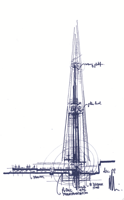
And with the increasing number of competitions and awards that require a story arc, anecdotally, many designers are going back at the end of a project to retrospectively create that all important ‘back of the napkin’ sketch that inspired the project in the first place (with apologies to Renzo Piano).
Now, where did I put my pencil…
The main theme was about the importance of sketching in order to structure your design thinking.
 |
| Guggenheim Bilbao - Frank Gehry |
Sketching elevations and floorplans, page layouts or wireframes conveys much information that would be lost if the same information was provided as a narrative. Sketches are easier for both the layman and expert to interpret and so understand the vision of the designer.
 |
| East Beach Cafe - Heatherwick Studio |
And with the increasing number of competitions and awards that require a story arc, anecdotally, many designers are going back at the end of a project to retrospectively create that all important ‘back of the napkin’ sketch that inspired the project in the first place (with apologies to Renzo Piano).
 |
| The Shard - Renzo Piano |
Now, where did I put my pencil…
Tuesday, 6 December 2011
Behavioural science
Behavioural science and behavioural economics show us that, very often, we do not behave in ways we would expect to if we were perfectly ‘rational’ human beings. Many of us still have not insulated our lofts, despite the fact that doing so will reduce our energy bills; we very rarely switch our bank accounts, despite the fact that we may benefit from higher saving rates elsewhere; and we may not yet have committed to becoming an organ donor, despite the fact that the majority of us would be willing to do so if asked.
Many of today’s issues have a strong behavioural component. From tackling anti-social behaviour, to education and health – our behaviours as citizens, parents and neighbours significantly affect the quality of our lives and that of others.
We can influence people’s behaviour in a number of different ways. Tough laws can be made, with fines for those who fail to comply with new legislation, or bans can be introduced that prevent people from eating certain types of food or engaging in particular types of activities.
This is where advertising and design can make a difference. We can give citizens more or better information. We can prompt people to make choices that are in line with their underlying motivations. And we can help to encourage social norms around healthier behaviours in ways that avoid inadvertently communicating that the ‘problem behaviour’ – rioting or driving whilst using a mobile phone or dropping litter – is relatively widespread.
And, if we know anything from behavioural science, it is that behaviour is strongly influenced by what we think others are up to.
Governments, businesses and charities are using the behavioural change MINDSPACE framework to support advertising and design decision-making that impacts upon the behaviour of citizens.
M I N D S P A C E
Messenger – We are heavily influenced by who communicates information
Incentives -– Our responses to incentives are shaped by predictable mental shortcuts such as strongly avoiding losses
Norms – We are strongly influenced by what others do
Defaults – We ‘go with the flow’ of pre-set options
Salience – Our attention is drawn to what is novel and seems relevant to us
Priming – Our acts are often influenced by subconscious cues
Affect – Our emotional associations can powerfully shape our actions
Commitment – We seek to be consistent with our public promises, and reciprocate acts
Ego – We act in ways that make us feel better about ourselves
For example, exercise is strongly affected by our tendency to discount future
gains, such as being fit and feeling good, relative to short-term pains. Turn this
problem around, such as by introducing an immediate pleasure through the fun of
the Stockholm Metro piano stairs (affect and salience). Making the stairs
eye-catching and fun to climb also had a motivating effect, in that once more people started taking the stairs, others tended to follow.
Or by changing the social norm around exercise with the London city bike hire scheme Seeing more people cycle creates a new social norm and visual prompt, encouraging more people to want to cycle.
In most cases, success will not come from a single design intervention. Instead it will come from a combined approach between many partners – local communities, professionals, businesses and citizens themselves.
A key objective is to try out a range of behavioural approaches – to experiment at local level – to find the most effective ways communicating and of ‘nudging’ citizens lifestyles in ways that make it easy for them to adopt 'good' behaviours.
Many of today’s issues have a strong behavioural component. From tackling anti-social behaviour, to education and health – our behaviours as citizens, parents and neighbours significantly affect the quality of our lives and that of others.
We can influence people’s behaviour in a number of different ways. Tough laws can be made, with fines for those who fail to comply with new legislation, or bans can be introduced that prevent people from eating certain types of food or engaging in particular types of activities.
This is where advertising and design can make a difference. We can give citizens more or better information. We can prompt people to make choices that are in line with their underlying motivations. And we can help to encourage social norms around healthier behaviours in ways that avoid inadvertently communicating that the ‘problem behaviour’ – rioting or driving whilst using a mobile phone or dropping litter – is relatively widespread.
And, if we know anything from behavioural science, it is that behaviour is strongly influenced by what we think others are up to.
Governments, businesses and charities are using the behavioural change MINDSPACE framework to support advertising and design decision-making that impacts upon the behaviour of citizens.
M I N D S P A C E
Messenger – We are heavily influenced by who communicates information
Incentives -– Our responses to incentives are shaped by predictable mental shortcuts such as strongly avoiding losses
Norms – We are strongly influenced by what others do
Defaults – We ‘go with the flow’ of pre-set options
Salience – Our attention is drawn to what is novel and seems relevant to us
Priming – Our acts are often influenced by subconscious cues
Affect – Our emotional associations can powerfully shape our actions
Commitment – We seek to be consistent with our public promises, and reciprocate acts
Ego – We act in ways that make us feel better about ourselves
For example, exercise is strongly affected by our tendency to discount future
gains, such as being fit and feeling good, relative to short-term pains. Turn this
problem around, such as by introducing an immediate pleasure through the fun of
the Stockholm Metro piano stairs (affect and salience). Making the stairs
eye-catching and fun to climb also had a motivating effect, in that once more people started taking the stairs, others tended to follow.
Or by changing the social norm around exercise with the London city bike hire scheme Seeing more people cycle creates a new social norm and visual prompt, encouraging more people to want to cycle.
In most cases, success will not come from a single design intervention. Instead it will come from a combined approach between many partners – local communities, professionals, businesses and citizens themselves.
A key objective is to try out a range of behavioural approaches – to experiment at local level – to find the most effective ways communicating and of ‘nudging’ citizens lifestyles in ways that make it easy for them to adopt 'good' behaviours.
Thursday, 10 November 2011
Character archetypes and patterning
Thanks to Dr Janis Wilson from Archetypology for a fascinating presentation at Wednesday’s Language Consultancy Association event, The Archetypology of Brands.
Archetypes are derived from neuroscience, psychology and classical studies. Essentially they are groups of certain personality traits and behaviours that can be recognised, categorised and expressed as a persona.
These personality traits and behaviours are laid down in the subconscious brain as ‘loose patterns’. The power of these loose patterns is that the brain is programmed to respond to stimuli that are a close fit. If your message is a close fit to the pattern, it triggers a response that requires fulfillment. If your brand offers this fulfillment, then the loose pattern is reinforced in a feedback loop that is now conditioned by your brand message.
In simple terms, you can use a structure of 12 classic archetypal characters – Innocent, Regular guy, Caregiver, Explorer, Hero, Outlaw, Lover, Creator, Ruler, Sage, Jester and Magician - to describe both your customers and your brand. In theory, if you know what your brand character is, and whom you want to talk to, adopting the correct tone of voice for a conversation between the two archetypes triggers this patterning and helps you to deliver your message. The key is to use the appropriate language between brand and audience archetypes to trigger the loose patterning in the subconscious.
Where it gets interesting is the knowledge that people move through all 12 archetypes at different life stages (although they will have a preferred archetype that they return to), whilst successful brands tend to stick with the same archetypal character.
Then it gets more complicated.
Each archetype has a number of sub-archetypes, and within these are a number of different, sometimes opposing behaviours.
So character archetypes can have a dark side. When a brand expression loses its way it tends to exhibit these opposing behaviours. This could explain why successful brands, for example, British Airways, BP, Coca-Cola, Gap, sometimes get it so wrong. The message no longer resonates as it disrupts the expected pattern. Returning to their archetypal character normally sees the brand refreshed and revitalised as the fit with the audience archetype loose pattern is restored.
As brand strategists, brand managers and copywriters, you can leverage these patterns to connect with and influence your customers.
Archetypes are derived from neuroscience, psychology and classical studies. Essentially they are groups of certain personality traits and behaviours that can be recognised, categorised and expressed as a persona.
These personality traits and behaviours are laid down in the subconscious brain as ‘loose patterns’. The power of these loose patterns is that the brain is programmed to respond to stimuli that are a close fit. If your message is a close fit to the pattern, it triggers a response that requires fulfillment. If your brand offers this fulfillment, then the loose pattern is reinforced in a feedback loop that is now conditioned by your brand message.
In simple terms, you can use a structure of 12 classic archetypal characters – Innocent, Regular guy, Caregiver, Explorer, Hero, Outlaw, Lover, Creator, Ruler, Sage, Jester and Magician - to describe both your customers and your brand. In theory, if you know what your brand character is, and whom you want to talk to, adopting the correct tone of voice for a conversation between the two archetypes triggers this patterning and helps you to deliver your message. The key is to use the appropriate language between brand and audience archetypes to trigger the loose patterning in the subconscious.
Where it gets interesting is the knowledge that people move through all 12 archetypes at different life stages (although they will have a preferred archetype that they return to), whilst successful brands tend to stick with the same archetypal character.
Then it gets more complicated.
Each archetype has a number of sub-archetypes, and within these are a number of different, sometimes opposing behaviours.
So character archetypes can have a dark side. When a brand expression loses its way it tends to exhibit these opposing behaviours. This could explain why successful brands, for example, British Airways, BP, Coca-Cola, Gap, sometimes get it so wrong. The message no longer resonates as it disrupts the expected pattern. Returning to their archetypal character normally sees the brand refreshed and revitalised as the fit with the audience archetype loose pattern is restored.
As brand strategists, brand managers and copywriters, you can leverage these patterns to connect with and influence your customers.
Tuesday, 2 August 2011
Scanpaths
Our eyes don’t read in a continuous steady line, but scan for information and look for patterns in a series of rapid left to right skips and pauses, known as saccadic movement.
In order to read efficiently, you recognise word shapes. As you read, you don’t look at individual characters. Instead your eyes scan the x-heights across the word and your brain compares the shape of the word outline with words in your memory, skipping over unfamiliar wordshapes, but creating comprehension based on the context of the surrounding words.
We do this because reading each individual letter in a word would be too time-consuming. Instead the eye moves and pauses as it looks for familiar patterns along a line of text.
The point where the eye pauses is called a fixation, whilst the regressive movement between points is called a saccade. A sequence of fixations and saccades across a design is called a scanpath. (Generally speaking, the number of fixations and saccades and length of time a reader spends on them indicates the relative readability of a typeface.)
In western society, by habit we start reading top left and finish bottom right, so these two areas of the page assume special significance for placing important information. Dominant fixation points like this are known as ‘hotspots’. Placing important information at these points, for example headlines top left, or calls to action at bottom right, help in the exchange of key information.
Research indicates that the human eye has the tendency to follow the same scanpaths when encountering familiar media, so in this situation a designer can place unexpected details or incongruous imagery in the design to create new hotspots to attract the readers attention.
The practical application of this insight is that careful placement of different content types can help lead the readers eye around a page or screen, create interest and/or understanding and improve the structural hierarchy of the communication.
In order to read efficiently, you recognise word shapes. As you read, you don’t look at individual characters. Instead your eyes scan the x-heights across the word and your brain compares the shape of the word outline with words in your memory, skipping over unfamiliar wordshapes, but creating comprehension based on the context of the surrounding words.
We do this because reading each individual letter in a word would be too time-consuming. Instead the eye moves and pauses as it looks for familiar patterns along a line of text.
The point where the eye pauses is called a fixation, whilst the regressive movement between points is called a saccade. A sequence of fixations and saccades across a design is called a scanpath. (Generally speaking, the number of fixations and saccades and length of time a reader spends on them indicates the relative readability of a typeface.)
In western society, by habit we start reading top left and finish bottom right, so these two areas of the page assume special significance for placing important information. Dominant fixation points like this are known as ‘hotspots’. Placing important information at these points, for example headlines top left, or calls to action at bottom right, help in the exchange of key information.
Research indicates that the human eye has the tendency to follow the same scanpaths when encountering familiar media, so in this situation a designer can place unexpected details or incongruous imagery in the design to create new hotspots to attract the readers attention.
The practical application of this insight is that careful placement of different content types can help lead the readers eye around a page or screen, create interest and/or understanding and improve the structural hierarchy of the communication.
Tuesday, 5 July 2011
Legibility and readability
Legible type and readable type seem like synonyms, but typographically they are not the same thing.
Legibility refers to the recognition of individual letters and words, whilst readability is the clarity and speed at which content can be read and understood.
The legibility of a typeface is dependent on its design (and perversely some typefaces are deliberately designed to be illegible), whilst readability depends on the skill of the typographer in choosing a typeface and arranging the type well on the page.
One of the more common mistakes designers make is to choose a typeface designed for one purpose and use it for something else for which it is unsuitable. A classic example is the use of the display face Avant Garde as a text font. Equally, you would not use a difficult to read brush script for a fire exit sign where the meaning needs to be read and decoded quickly.
Since the introduction of the Disability Discrimination Act in the UK in 1995 and the Disability and Equality Act in 2010, typographic design needs to be inclusive of people with a wide range of visual impairments. Making sure that your type is structured to be legible and readable was always a hallmark of good design, but now it is a prerequisite.
In the next two posts I'm going to look at little deeper into some of the issues around the legibility and readability of type.
Legibility refers to the recognition of individual letters and words, whilst readability is the clarity and speed at which content can be read and understood.
The legibility of a typeface is dependent on its design (and perversely some typefaces are deliberately designed to be illegible), whilst readability depends on the skill of the typographer in choosing a typeface and arranging the type well on the page.
One of the more common mistakes designers make is to choose a typeface designed for one purpose and use it for something else for which it is unsuitable. A classic example is the use of the display face Avant Garde as a text font. Equally, you would not use a difficult to read brush script for a fire exit sign where the meaning needs to be read and decoded quickly.
Since the introduction of the Disability Discrimination Act in the UK in 1995 and the Disability and Equality Act in 2010, typographic design needs to be inclusive of people with a wide range of visual impairments. Making sure that your type is structured to be legible and readable was always a hallmark of good design, but now it is a prerequisite.
In the next two posts I'm going to look at little deeper into some of the issues around the legibility and readability of type.
Wednesday, 19 January 2011
Messaging
According to the New York Times, the average person is subjected to over 5,000 advertising messages a day. The more messages we perceive, the greater the background noise.
The more you shout, the more noise is created. Everybody wants to be heard. Everybody shouts. To rise above the noise, you need to shout louder.
Or do you?
What your clients need is a message that cuts through the noise, even if you only whisper.
Formulating and structuring your message is therefore critical to making sure you are heard.
Needs
Establishing the needs of your target group – and therefore the types of messages that are likely to resonate with them – is a key component of your message.
Maslow expressed his triangular hierarchy of needs in 1954. Basic physical needs form the base of the pyramid. Once these are satisfied, people’s desires move up to the next level, safety needs, and then social, esteem and self-actualisation at the apex. We move up and down through these levels depending on our lifestage and circumstances.
To be successful, messages, goods and services need to be aligned with the needs of your target audience at their appropriate lifestage.
For instance, expensive makeup is neither a physiological, safety nor social need. Loreal plays on esteem needs of the professional woman with disposable income ‘because you’re worth it’.
Arguments
Rather than shouting louder, it is better to convince a person with a series of statements establishing your proposition.
That’s right, you came here for an argument.
The first stage in an argument is to delimit the terms of reference. What is in and what is out. Provide too much unnecessary information and your audience gets bored.
Then there has to be a structure to the message to make it worth listening to; a narrative with a beginning, middle and end; a dialogue; a setup and a payoff.
The actual message itself can consist of a primary argument (eating 5 portions of fruit and vegetables a day is healthy) and secondary arguments (fruit and vegetables are cheap and easy to prepare) that help convince the receiver by supporting the main argument.
The optimum message is based on the primary argument, but where there are several supporting arguments, the strongest one is normally used first with the second strongest left until last and the weakest ones in between.
Both primary and secondary arguments may appeal to logic (health benefits) or emotion (better skin tone) to get their point across. However, whilst the receiver can be convinced by rational arguments, logic is no more important than emotion in decision-making.
This is because the receiver firstly identifies with and adopts a position on your message. Based on the position takes, the receiver then filters all the arguments and counter-arguments. If the pros outweigh the cons, then a subconscious decision is made and the receiver rejects the opposition position. In essence, the receivers convince themselves of the course of action to take.
Generally arguments are one-sided, as the receiver can be relied upon to provide the subvocalised opposition. However, two-sided arguments, where the sender expresses the disadvantages as well as the advantages of their position, can suggest honesty and integrity.
Finally, it is important that your audience feels involved and proactive in the messaging process. Your story leads the way, but by allowing the receiver space to work out your message for themselves, they are more likely to come to the desired conclusion.
Aligning your message with the needs of your audience and developing a clear argument gives you the cut-through that you need and the best chance of being heard.
The more you shout, the more noise is created. Everybody wants to be heard. Everybody shouts. To rise above the noise, you need to shout louder.
Or do you?
What your clients need is a message that cuts through the noise, even if you only whisper.
Formulating and structuring your message is therefore critical to making sure you are heard.
Needs
Establishing the needs of your target group – and therefore the types of messages that are likely to resonate with them – is a key component of your message.
Maslow expressed his triangular hierarchy of needs in 1954. Basic physical needs form the base of the pyramid. Once these are satisfied, people’s desires move up to the next level, safety needs, and then social, esteem and self-actualisation at the apex. We move up and down through these levels depending on our lifestage and circumstances.
To be successful, messages, goods and services need to be aligned with the needs of your target audience at their appropriate lifestage.
For instance, expensive makeup is neither a physiological, safety nor social need. Loreal plays on esteem needs of the professional woman with disposable income ‘because you’re worth it’.
Arguments
Rather than shouting louder, it is better to convince a person with a series of statements establishing your proposition.
That’s right, you came here for an argument.
The first stage in an argument is to delimit the terms of reference. What is in and what is out. Provide too much unnecessary information and your audience gets bored.
Then there has to be a structure to the message to make it worth listening to; a narrative with a beginning, middle and end; a dialogue; a setup and a payoff.
The actual message itself can consist of a primary argument (eating 5 portions of fruit and vegetables a day is healthy) and secondary arguments (fruit and vegetables are cheap and easy to prepare) that help convince the receiver by supporting the main argument.
The optimum message is based on the primary argument, but where there are several supporting arguments, the strongest one is normally used first with the second strongest left until last and the weakest ones in between.
Both primary and secondary arguments may appeal to logic (health benefits) or emotion (better skin tone) to get their point across. However, whilst the receiver can be convinced by rational arguments, logic is no more important than emotion in decision-making.
This is because the receiver firstly identifies with and adopts a position on your message. Based on the position takes, the receiver then filters all the arguments and counter-arguments. If the pros outweigh the cons, then a subconscious decision is made and the receiver rejects the opposition position. In essence, the receivers convince themselves of the course of action to take.
Generally arguments are one-sided, as the receiver can be relied upon to provide the subvocalised opposition. However, two-sided arguments, where the sender expresses the disadvantages as well as the advantages of their position, can suggest honesty and integrity.
Finally, it is important that your audience feels involved and proactive in the messaging process. Your story leads the way, but by allowing the receiver space to work out your message for themselves, they are more likely to come to the desired conclusion.
Aligning your message with the needs of your audience and developing a clear argument gives you the cut-through that you need and the best chance of being heard.
Tuesday, 11 January 2011
Perception II (discernment)
In previous posts I looked at some theoretical tools to refine and improve messaging. Among these, some of the more practical ones are chunking, perception, scanpaths, wayfinding and content structure;
In perception, there are two key structures involved, difference and discernment.
Discernment and Gestalt pschology
Adjacent objects are generally perceived and processed as a group and considered to have a like meaning. Objects which share similar attributes – size, colour, shape, direction – are also perceptually grouped together.
Grouping objects to create contextual relationships and create implied alignments helps a designer to guide the viewer’s eye through the content.
These principles of perception are explored in the theories of Gestalt psychology, that examine ‘the essence or shape of form’. The phrase ‘The whole is greater than the sum of the parts’ is often used when explaining Gestalt theory.
Fundamental to Gestalt are the laws of Pragnanz, which state that we tend to order things in a manner that is regular, ordered and symmetric;
Gestalt psychology is frequently used in user interface design, for example where text fields and buttons are placed with reference to the laws of similarity and proximity.
Designing familiarity in to layouts through consistent placement of similar types of content creates a rhythm and flow in your designs that allow the viewer to process information quickly and efficiently.
In perception, there are two key structures involved, difference and discernment.
Discernment and Gestalt pschology
Adjacent objects are generally perceived and processed as a group and considered to have a like meaning. Objects which share similar attributes – size, colour, shape, direction – are also perceptually grouped together.
Grouping objects to create contextual relationships and create implied alignments helps a designer to guide the viewer’s eye through the content.
These principles of perception are explored in the theories of Gestalt psychology, that examine ‘the essence or shape of form’. The phrase ‘The whole is greater than the sum of the parts’ is often used when explaining Gestalt theory.
Fundamental to Gestalt are the laws of Pragnanz, which state that we tend to order things in a manner that is regular, ordered and symmetric;
- Principle of closure – the viewer infers elements in order to complete a regular figure
- Principle of similarity – the viewer groups similar elements together
- Principle of proximity – spatial proximity induces the viewer to perceive a group
- Principle of symmetry – symmetrical images are perceived by the viewer as a group even if separated by distance
- Principle of continuity – The viewer infers continuing patterns
- Principle of common fate – Elements with the same direction are perceived by the viewer as a group
Gestalt psychology is frequently used in user interface design, for example where text fields and buttons are placed with reference to the laws of similarity and proximity.
Designing familiarity in to layouts through consistent placement of similar types of content creates a rhythm and flow in your designs that allow the viewer to process information quickly and efficiently.
Perception I (difference)
In a previous post, I talked about how designers transmit knowledge, share concepts and process information through language, and how structure and legibility affect the visualisation of messages and inform the design decisions you make on a daily basis.
To help your audience understand your messaging, you need to know how they will receive and decode the information you send.
Scientific study has provided designers with a number of theoretical tools to refine and improve their messages. Among these, some of the more practical tools are chunking, perception, scanpaths, wayfinding and content structure.
In perception, there are two key structures involved, difference and discernment.
Difference threshold and Weber’s Law
Understanding our ability to perceive information and distinguish one information set over another can help designers target their messages for maximum impact.
Weber’s Law of Just Noticeable Differences (no, really!) suggests that there is an identifiable minimum amount of change that can be defined for a viewer so that they are able to notice a difference in any one design
If the amount of perceptual change remains a constant (and can thus be predicted unconsciously by the viewer), then it is easier for your audience to process and distinguish between different types of information. This regular rate of change is known as the ‘difference threshold’.
Weber’s Law can be used to help designers make constructive choices in making information follow an obvious hierarchy.
For example, setting a consistent rule for the differential sizing of type headings, say in 4 point increments, establishes a clear information hierarchy in the mind of the audience.
Similarly, decisions on the relative weights of fonts in typeface design can also be informed by identifying the difference threshold.
User testing of visual assumptions against Weber’s Law can help confirm the designer’s intuition regarding aesthetic considerations and help establish clearer communication with the audience.
To help your audience understand your messaging, you need to know how they will receive and decode the information you send.
Scientific study has provided designers with a number of theoretical tools to refine and improve their messages. Among these, some of the more practical tools are chunking, perception, scanpaths, wayfinding and content structure.
In perception, there are two key structures involved, difference and discernment.
Difference threshold and Weber’s Law
Understanding our ability to perceive information and distinguish one information set over another can help designers target their messages for maximum impact.
Weber’s Law of Just Noticeable Differences (no, really!) suggests that there is an identifiable minimum amount of change that can be defined for a viewer so that they are able to notice a difference in any one design
If the amount of perceptual change remains a constant (and can thus be predicted unconsciously by the viewer), then it is easier for your audience to process and distinguish between different types of information. This regular rate of change is known as the ‘difference threshold’.
Weber’s Law can be used to help designers make constructive choices in making information follow an obvious hierarchy.
For example, setting a consistent rule for the differential sizing of type headings, say in 4 point increments, establishes a clear information hierarchy in the mind of the audience.
Similarly, decisions on the relative weights of fonts in typeface design can also be informed by identifying the difference threshold.
User testing of visual assumptions against Weber’s Law can help confirm the designer’s intuition regarding aesthetic considerations and help establish clearer communication with the audience.
Thursday, 2 December 2010
Probability, randomness and chance
It’s not strictly on topic, but I caught a fascinating discussion on probability, randomness and chance on Radio 4’s series The Infinite Monkey Cage.
Co-presented by astrophysicist Professor Brian Cox, the discussion ranged from the ‘birthday paradox’ where the probability of two people in a random group of 23 chosen people sharing the same birthday is greater than 50%, to the idea that people are predisposed to pattern recognition because we have evolved with the survival mechanism to extract patterns from not much data ie. spotting tiger stripes in the surrounding foliage.
Mind you I’ve enjoyed what Professor Cox has to say ever since I accidentally watched Danny Boyle’s Sunshine with the scientific commentary dubbed on to the action and found that it all made sense (sort of).
But one of the questions raised by the programme was to ask why people interpret a chance event as being somehow preordained, and why we seek to interpret such results with other meanings. The thought was that because people have a memory of past events, we use that as a filter to understand present events.
It reminded me of how patterns and numbers crop up all the time in design and how designers can use this knowledge to engage their audience by having them infer content structure, through the filter of previously remembered events, from the groupings and alignments in the design.
Such relationships as the golden ratio of 1 to 1.618, the rule of grouping in threes and fives, picture composition using intersecting thirds, and all manner of gestalt relationships are used to help the viewer to process information more quickly.
A practical example of this effect can be seen in website design. Most peoples experiences of the web are made elsewhere, so your site needs to conform to the expected web page layout if you want the user to be able to quickly engage with the content.
Of course, knowing that rule means that, in the case of Johnson Banks, you can break it for good effect if you want to surprise your audience.
 |
| Brian Cox |
Mind you I’ve enjoyed what Professor Cox has to say ever since I accidentally watched Danny Boyle’s Sunshine with the scientific commentary dubbed on to the action and found that it all made sense (sort of).
But one of the questions raised by the programme was to ask why people interpret a chance event as being somehow preordained, and why we seek to interpret such results with other meanings. The thought was that because people have a memory of past events, we use that as a filter to understand present events.
It reminded me of how patterns and numbers crop up all the time in design and how designers can use this knowledge to engage their audience by having them infer content structure, through the filter of previously remembered events, from the groupings and alignments in the design.
Such relationships as the golden ratio of 1 to 1.618, the rule of grouping in threes and fives, picture composition using intersecting thirds, and all manner of gestalt relationships are used to help the viewer to process information more quickly.
A practical example of this effect can be seen in website design. Most peoples experiences of the web are made elsewhere, so your site needs to conform to the expected web page layout if you want the user to be able to quickly engage with the content.
Of course, knowing that rule means that, in the case of Johnson Banks, you can break it for good effect if you want to surprise your audience.
Tuesday, 30 November 2010
Chunking information (Millar’s magic number seven)
How you transmit knowledge, share concepts and process information through language, and how structure and legibility affect the visualisation of messages informs the design decisions you make on a daily basis.
To help your audience understand your messaging, you need to know how they will receive and decode the information you send.
Scientific study has provided designers with a number of theoretical tools to refine and improve their messages. Among these, some of the more practical tools are chunking, perception, scanpaths, wayfinding and content structure;
Chunking information (Millar’s magic number seven)
In cognitive psychology, chunking refers to a strategy for making short-term memory more effective.
‘The Magical Number Seven, Plus or Minus Two’ a highly cited 1954 paper from Harvard psychologist George Miller argued that the number of objects (or ‘chunks’) of information the average person can hold in short-term memory is 7 +/-2.
Capacity for short-term memory varies between individuals (and subject expertise), but generally people can process 7 +/-2 individual pieces of information at any one time. This principle can be extended to chunk more complex information. Dividing complex information into subsets that also number 7 +/-2 makes it easier to process, understand and recall.
A practical example of Millar’s Law is the conversion of telephone numbers to smaller, more memorable 4-digit chunks ie. 02079460357 converted to (020) 7946 0357.
Therefore, well considered page or interface design needs to account for the reader’s ability to process multiple information sets in short-term memory. By using layout, colour, typeface, typesize and placement you can ensure that complex information is always arranged into groups numbering 7+/-2 and is thus easier for your audience to process and to understand.
Don’t believe me? Then why do you always make a shopping list for more than five items?
To help your audience understand your messaging, you need to know how they will receive and decode the information you send.
Scientific study has provided designers with a number of theoretical tools to refine and improve their messages. Among these, some of the more practical tools are chunking, perception, scanpaths, wayfinding and content structure;
Chunking information (Millar’s magic number seven)
In cognitive psychology, chunking refers to a strategy for making short-term memory more effective.
‘The Magical Number Seven, Plus or Minus Two’ a highly cited 1954 paper from Harvard psychologist George Miller argued that the number of objects (or ‘chunks’) of information the average person can hold in short-term memory is 7 +/-2.
Capacity for short-term memory varies between individuals (and subject expertise), but generally people can process 7 +/-2 individual pieces of information at any one time. This principle can be extended to chunk more complex information. Dividing complex information into subsets that also number 7 +/-2 makes it easier to process, understand and recall.
A practical example of Millar’s Law is the conversion of telephone numbers to smaller, more memorable 4-digit chunks ie. 02079460357 converted to (020) 7946 0357.
Therefore, well considered page or interface design needs to account for the reader’s ability to process multiple information sets in short-term memory. By using layout, colour, typeface, typesize and placement you can ensure that complex information is always arranged into groups numbering 7+/-2 and is thus easier for your audience to process and to understand.
Don’t believe me? Then why do you always make a shopping list for more than five items?
Subscribe to:
Posts (Atom)