Wednesday 28 September 2011

The Power of Making

‘Alphabet’, pencil-tip structures, Dalton Ghetti, USA.
Photo by Sloan T. Howard Photography
And so to the Power of Making exhibition at the V&A. Making is the most powerful way that we solve problems, express ideas and shape our world. What and how we make defines who we are, and communicates who we want to be.

For designers, making is a chosen vocation: a way of thinking, inventing and innovating. It’s a delight to be able to shape a material and say ‘I made that’.

I particularly liked the way materials have been juxtaposed so that the soft ‘fur’ of an animal or dress is composed of hard metal, or a robot exoskeleton made of wood.

Every object in this exhibition has been made by adding, subtracting or transforming material, or by combining these processes.

Many people think that craft is a matter of executing a preconceived form or idea, something that already exists in the mind or on paper. Yet making is also an active way of thinking, something which can be carried out with no particular goal in mind. In fact, this is a situation where innovation is very likely to occur.

Even when making is experimental and open-ended, it observes rules and structure. Craft always involves parameters, imposed by materials, tools, scale and the physical body of the maker. Sometimes in making, things go wrong. An unskilled maker, hitting the limits of their ability, might just stop. An expert, though, will find a way through the problem, constantly unfolding new possibilities within the process.

Wednesday 14 September 2011

Designing Simplicity

Making life simpler, easier and less stressful. Aren’t these a big part of what good design can do to help us live well? 

Designing Simplicity was the first in a series of Inspire + Connect evening events organised by the Design Council Challenges team.

The speakers were Sam Hecht, co-founder of Industrial Facility, whose ethos of striving for simplicity has led to more user friendly products, and Dan Thompson, founder of the Empty Shops Network, and the instigator of the recent #riotcleanup efforts in London.

Sam talked about his design process - removing unnecessary layers so that the function of an object is simple and clear. But he also recognised that everything is a product, that every product is part of a system, and that every system exists in an environment.

The design does not stop at the edges of the object, but is an extension of the whole.

Dan is not a designer, but he facilitates activities and change by the simplest means possible. In the case of #riotcleanup, an idea, a mobile phone, a twitter account, a memorable hashtag and a broom.

In the first 24hrs of #riotcleanup, 87,000 twitter followers believed that they could make a difference. The key was simplicity - a straightforward, practical action using basic equipment meant a low barrier to entry.

Both speakers demonstrated that a structured approach to designing simplicity can produce incredibly effective results.

Monday 12 September 2011

Rhetorical images

Rhetoric is the art of using language for the purpose of persuasion – to effectively convey the ideas of the speaker to their audience.

But how can you structure an image communicate a message?

As a communicator, you can still apply the four classical rhetorical methods (known as tropes) to the way you design with images;
  • The presentative image shows
  • Metonymy illuminates
  • Synecdoche indicates
  • Metaphors and similes compare

Presentative images
iPad 2 ad - presentative image
Presentative images are used when you want to show what something looks like, or to highlight certain features. The image is a literal representation of the subject matter.

Raising a presentative image to the rhetorical level requires some imagination. Vehicle images or packshots of computers are a classic example. The skill lies in the arrangement of the various components, choice of the right background, dramatic lighting or coloured gels, use of a wide-angle lens or a low camera angle. A hand holding the object gives an idea of scale. All these methods are ways of bringing the object to life.


Metonomy
Whitehall sign - metonomy image
You can make abstract concepts comprehensible to your audience by using the principle of metonomy. By creating a closeness between an abstract concept and a concrete idea, the latter is made to stand for the former. Examples in rhetorical terms might be the UK government represented by the street sign for Whitehall, or the idea of freedom being represented by an image of the Statue of Liberty.


Synecdoche
Stethoscope - synecdoche image
Rhetorical substitution, synecdoche, indicates something by having the part standing for the whole. For example, a stethoscope image can be used to represent a doctor (or a hospital). As the viewer engages with the image, they create the entire medical profession in their imagination.

Synecdoche is also used to prove that a visual message is relevant to its subject. By placing an object in its natural context, the viewer sees both the part and the whole together, and the message carried by the object is reinforced. For example a stethoscope around the neck of a figure in scrubs suggests a doctor. Because the two parts of the image support each other, the viewer is reassured that the entire message is believable.


Metaphors and similes
Guinnness 'Surfer' ad - similie
To help others to understand your message, you can use comparative language to illustrate, reinforce or clarify your point. Metaphors suggest similarities between things by substitution, for example, stating that something is something, whilst similes suggest something is like something.

For example, advertisers tend to use metaphor or similie in promoting alcoholic drink brands, because the rules on what you can claim for your product are very strict. Using visual metaphor or similie allows sophisticated brand characteristics to be quickly established in the mind of the audience.


In practice
It is possible to use all four tropes for the same topic, depending on your intended message.

For instance Land Rover (for no other reason than I like Land Rovers);

Presentative image shows (the whole)
Metonomy image illuminates
(an aspect of the subject)
Synecdoche image indicates
(by using a part of the whole)


Metaphor and similie compares
(an attribute of the subject)

Tuesday 6 September 2011

Grids

RayGun magazine cover
David Carson is renowned for his intuitive approach to magazine design. Working on the niche magazines Surfer, Beach Culture and later music magazine RayGun, his design work mixed raw images and type for a young, iconoclastic and visually aware audience that had the passion to put effort into reading his layouts.

Carson’s method is to design every page from scratch, reading the magazine article and trying to make sure that the content is interpreted in the page design. He believes that over-reliance on a grid can lead to laziness, as designers accept the pre-formatted settings in their software and produce bland layouts.

“I can’t work with any kind of guidelines on the computer – the first thing I do is eliminate them… I never learned what a grid was… and didn’t see a place for them in my work.”
David Carson
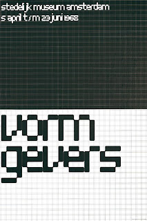
Vormgivers exhibition poster

Modernist typographer Wim Crouwel sits at the opposite end of the design spectrum. The grid methodology has underpinned his work for the last half century and still makes sense to him today.

Wim’s working method relies on a rigorous hierarchical analysis of text and image. This structured approach to the relative positioning of elements on the page inevitably led to his use of a grid as the primary method of arranging content, and for providing the reader with access to it.

“I was called “gridnik” because all the time I was talking about grids and giving lectures about them.”
Wim Crouwel

Two great designers, two different approaches.

Personally, I love using grids. The point of them is to provide a structure within which a designer or typographer, sometimes working in a collaborative team, can arrange content.

It provides a rational basis on which a set of recognisable typographic conventions can be arranged, creating a consistent pattern that allows the reader to navigate content with clarity.

As a device, the grid can be as simple as a single page-sized cell, or as complex as Karl Gerstner’s ‘perfect’ 58-unit grid for Capital.

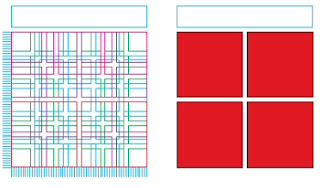
Karl Gerstner's 58-unit grid

Where the content is continuous text, a simple single column structure is all that is required, but in a more complex magazine format, a grid structure with the flexibility to accommodate more complex and varied material will be needed.

The starting point for both types of grid is the content type and the choice of typeface, size and leading. The logic of the grid structure can then be developed in relation to the format.

Creating a grid
Geometry and mathematics are, broadly speaking, the two approaches to creating a grid.

Geometrical grids are based on the golden section (1:1.618), a ratio of width to height. This approach is typically seen in book publishing.

Mathematical (or modular) grids are based entirely on the logic of the page and type size. This approach is one of the characteristics of the International Typographic (Swiss School) style of design.

The golden section
Traditional book page design works with a pair of facing pages with margins and content arranged according to the golden section (1:1.618). The geometry of the page requires no calculations, the positioning of elements being derived from the size and shape of the pages themselves. This approach works well for single or double columns of type, but is less successful for more complex layouts.

Fibonacci sequence
An alternative geometrical approach is to use the Fibonacci sequence of numbers to establish margins. The relative proportions are inner margins of 3 units, top and outer margins of 5 units and a bottom margin of 8 units.

Width to height ratio (‘A’ sizes)
The ISO ‘A’ series of paper uses a ratio based on a series of root two rectangles, where each rectangle has the same width to height ratio if halved. The starting point is the A0 size of paper, with each subdivision exactly half the size of the previous size.

Modular grid
A modern basic grid subdivides the page into a number of smaller fields or modules. Vertically the page is split into margins and columns, generally measured in millimetres, whilst horizontally the page is divided by the baseline grid, measured in points or millimetres. The text baseline grid combined with the number of columns on the page determines the size and shape of the modules in the grid.

The choice of grid methodology to use depends on the nature of your project, the type of content and your own working methods.

“The grid system is an aid, not a guarantee. It permits a number of possible uses and each designer can look for a solution appropriate to his personal style. But one must learn how to use the grid; it is an art that requires practice.”
Josef Müller-Brockmann

More terrific grid-centric articles can be found at The Grid System, an ever-growing resource where graphic designers can learn about grid systems, the golden ratio and baseline grids.