Tuesday 24 October 2017

Jost Hochuli: In Conversation


Jost Hochuli
Jost Hochuli, the renowned book designer, graphic designer, typographer, printer and author of Designing Books, and Detail in Typography has had a slow but steady impact on modern book design and typography. First, through his work, especially that for VGS and Typotron; then through his teaching at the Schüle für Gestaltung in St. Gallen; and more widely through his publications on typography and book design.

Through these books, especially the English language edition of Designing Books, he has become probably the most influential theorist of book design since Jan Tschichold.

Jost’s belief is that book design is not just concerned with beautiful objects, but rather it is about making useful tools for reading.

Apprenticed to Rudolf Hostettler at Zollikofer Verlag (publishing company) in the 1950’s, anecdotally only two typefaces were permitted in the works – Akzidenz Grotesk and Times New Roman. Working in the modernist style known as Swiss or International school, the goal of the apprentice typographer was to simplify page design and layout so that there was no typographic ‘noise’.

Although we think of the Swiss school as being the dominant style in Europe in the fifties and sixties, in fact it was largely confined to Holland, Germany and the German-speaking part of Switzerland. Even within Switzerland, designers in the French-speaking cantons looked to France and Didot, designers in the Italian-speaking cantons to Milan and Bodoni.

Nevertheless, the Swiss school, following the path laid down by the Bauhaus architect, industrial designer and typographer Max Bill won worldwide recognition in the decades following the Second World War

“We were simply louder” said Hochuli.

Bill urged Swiss designers to follow modernist “‘asymmetric’ or organically formed typography”, to reject “the conventional text-image of axial symmetry”.

In response, contemporary designer Jan Tschichold defended the need to design some books “in the manner of traditional typography” while allowing that others might be more suitable done in Bill’s ‘functional’ typography.


As Hochuli developed his style, he was influenced by Tschichold’s plea for “the right to work in the way that I find best”, whether ‘newly revived traditional typography’ or ‘functional typography’.

Although Tschichold never visited the Zollikofer works, Hostettler considering him “A traitor to modernism”, Hochuli followed a middle path between the modernism of the Bauhaus and die neue typographie and traditional book design, before ultimately rejecting the rigidity of the grid.


Preferring to use consistent channels of white space between elements to create harmony on the page, Hochuli’s graphic design practice aimed to capture the feeling of the work through typographic layout that created “adventures on a page”.

Thus echoing the principle ‘form follows function’, Hochuli’s preference is for content to come before design, although, as Hochuli has reiterated on several occasions, the designer must not follow dogma.

--

Jost Hochuli was in conversation with Tony Pritchard, LCC senior lecturer and ISTD board member.

In association with International Society of Typographic Designers, London College of Communication, Presence Switzerland and the Swiss Cultural Fund.


Wednesday 4 October 2017

1,516 mass shootings in 1,735 days

1,516 mass shootings in 1,735 days: America's gun crisis – in one chart

The attack at a country music festival in Las Vegas on Monday 2 October 2017 that left at least 58 people dead is the deadliest mass shooting in modern US history – but there were six other mass shootings in America in the previous week alone.

Data compiled by the Gun Violence Archive reveals a shocking human toll: there is a mass shooting – defined as four or more people shot in one incident, not including the shooter – every nine out of 10 days on average.

The graphic, produced by The Guardian US interactive team, a small group of designers, interactive developers and journalists working alongside the editorial team, is horrifying in it's simplicity.


A simple but effective idea demonstrating the power of information graphics to tell a story. As you scroll down, the enormity of the carnage over the last four years becomes apparent, leaving you slack-jawed at the seemingly never-ending toll - an infinite scroll of injury and death.

Thursday 21 September 2017

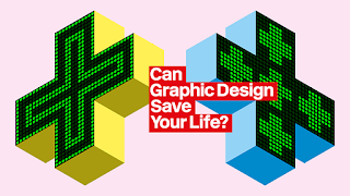
Can Graphic Design Save Your Life?

And so to the Wellcome Collection, and their exploration of the relationship between graphic design and health Can Graphic Design Save Your Life?.

The exhibition highlights the widespread and yet subliminal nature of graphic design in constructing and communicating healthcare messages; words and images, signs and symbols, colour, scale and format, all carefully structured to communicate, and in doing so shaping our environment, society and personal health.

Creating a health message that an individual is willing to self-identify with, and consequently inspire action or change their behavior, requires a range of design interventions. Surprisingly, sometimes a small structural change can create the greatest impact.

For example, ‘nudge’ theory suggests that presenting people with a mandated choice or opt-out question makes it significantly more likely that they would choose to carry an organ Donor card.

The exhibition is divided into zones; persuasion, education, hospitalisation, medication, contagion and provocation.

Each of which explain one aspect of design in health, from national public awareness campaigns such as those for AIDS (TBWA) and the Samaritans (BBDO), to design research such as the NPSA’s findings on improving pharmaceutical packaging design and patient safety (RCA’s Helen Hamlyn Centre for Design).

I enjoyed seeing Dr. John Snow’s historic map of cholera deaths around the Broad street pump, and Florence Nightingale’s ‘rose’ charts to illustrate deaths from disease in the Crimea, classics of information design.

On a larger scale, the sympathetic A&E information and wayfinding system for the NHS (Pearson Lloyd) and the now ubiquitous emergency service ‘battenburg’ patterns (PSDB) are reminders of how effective design ideas quickly spread and become an accepted part of the environment.

Whether taking the correct tablet, deciding to donate an organ or to practice safe sex, graphic design influences our health and wellbeing. Can Graphic Design Save Your Life? considers just how vital graphic design can be.


Sunday 5 March 2017

Get some structure in your life

Time to clean up my desktop.

There are only four rules:
  1. Action it
  2. File it
  3. Delegate it
  4. Bin it.
That's all.

You wanted more?

Sorry.

Saturday 19 November 2016

Type talks

We know that typefaces convey emotion as well as information.

Sarah Hyndman’s talk at the Museum of Packaging set out to explore the connections between social change, popular sentiment and typography.

In a time of increased industrialisation and globalisation, where jobs and livelihoods are threatened, where an influx of labour from elsewhere depresses wages, where old certainties are stripped away as financial systems, social order, and country borders are threatened. New leaders articulate a radical vision of the future, whilst those outside of the elite look on powerless and in search of a voice.

Sound familiar?

In 1970 the raw anger of a generation that felt excluded, marginalised and ignored found their voice in Punk. Expressed through attitude, music, style and typography, Punk’s anti-establishment stance found its visual expression through the work of Jamie Reid.

The stylistic conventions of Punk included mixing type styles and weights, overprinting, cluttered pages, deliberate mistakes, cultural references, blurred photography and an embrace of general messiness. All elements that rejected the rules and structure of the international style, took the typographic grids of modernism, a visual shorthand for the corporate industrial complex, and tore them apart.

Treating type as if it was a photograph freed designers from the restrictions of typesetting within a structured grid. Cut-out, photocopied and hand-drawn type also had the advantage of being able to bypass expensive printers, the rawness of the layouts on labels, flyers and zines perfectly matching the urgency and language of the authors.

 Ironically, the vibrancy of the look led to it becoming co-opted by the very establishment that Punk aimed to subvert. First ignored and feared, then embraced and tamed.

Kellog’s Squares anyone?

The creation of an expressive style that symbolises opposition to the establishment has historical precedent, and the inevitable co-option of anti-establishment typography into the mainstream follows a similar pattern. First World War Germany saw the appearance of Dadism. 1960’s America brought us psychedelia and pop art against the backdrop of the Vietnam war. The industrial decline of The UK in the 1970’s gave rise to Punk, whilst the 1980’s brought New wave and the postmodern typographic design of Brody, Saville, 8vo and Tomato (amongst others).

And so to 2016, and the rise of the Snapchat generation. With one typeface, limited tools and only a 10 second viewing window, Snapchat is the latest medium for millennials to share the moments that matter to them. it’s really immediate and ugly. You’re not designing, it’s just Times New Roman or Ariel and then it’s gone. It’s the closest thing now to how Punk looked like then.

Unstructured information and emotion that is explicitly short-lived and self-deleting, so it can’t be filtered, searched, indexed or saved, but provides today's authentic voice.

Friday 21 October 2016

Adobe CC Export for Screens

Much excitement over the introduction of Adobe Illustrator CC’s ‘Export for Screens’ tool, bringing a structured workflow to managing and exporting web assets.


Export for Screens

So rather than having to create individual artboards at different sizes for responsive websites, ‘Export for Screens’ acts like a mini CMS, allowing you to design once, and publish artboards to multiple iOS and Android device preset formats.

Export Assets
But wait – there’s more! Export for Screens also has an option for exporting individual graphics assets. Great for producing individual icons or other graphics without having to slice up the overall layout.

And all your saved assets can live update, so if you need to edit the base artwork, the graphics update automatically.

And of course, if you export to Creative Cloud, your assets are available for anyone else working on the project.

Now I have to admit that I’m ambivalent about Adobe’s Creative Cloud. The range of tools, features and storage that Adobe offer temp me to commit completely to their platform, and I find that uncomfortable.

However, with ‘Export for screens’, I’m almost won over.

Top tips:
  • Make sure your artwork is aligned to the pixel grid. [Note to Adobe – when will you offer a ‘snap artboard to grid’ option?]
  • Images cropped with a clipping path export to the size of the unclipped image & need to be re-cropped in Photoshop.

Thursday 13 October 2016

Noto

Photo: Andy Dunn
Noto, Google’s multi-language font family from Monotype is designed to work over a wide range of different languages and on any device.
 

Noto covers more than 800 languages and 100 written scripts, and includes serif and sans serif fonts across eight weights as well as numbers, emoji, symbols, and musical notation.
 

The result of a five-year collaboration between Google and Monotype, one of the main aims for the typeface is to allow cultures to communicate digitally and help enable global communications across borders, languages and cultures.
 

Monotype has researched and digitally designed the characters, writing systems and alphabets for each Noto typeface, applying the rules and idiosyncrasies for individual languages to the fonts, based on the Unicode standard – a character coding system that defines the characters and languages that can be displayed and used within a computer system.
 

Because new scripts are constantly being added to Unicode, when a computer is unable to display a character in a font, it displays blank boxes instead. These are colloquially known as “tofu”. The name Noto is taken from Google’s goal of having “no more tofu”.

Monotype linguistic typographer Kamal Mansour says: “The aim of the Noto project is to provide digital representation to all the scripts in the Unicode Standard. That in particular is something that many different language communities could not afford to do on their own.”