Friday 16 December 2011

Imaginary customers

Designing a successful user experience requires a clear understanding of your audience –their wants, needs, likes, dislikes and likely behaviours. Put together, this information forms a user profile.

If your project has sufficient time and budget, a range of focus groups composed of people who fit the user profile (and there may be more than one) can be used to inform your initial designs and then test each stage of design development. Insights from focus group testing can be used to refine the design and make sure that it resonates with your target audience.

However, if time and budget are unavailable, even a little audience research goes a long way. One of the simplest and cost-effective ways of gaining insight into your audience is to use an imaginary user profile, or persona, created from desk research, project knowledge and a little common sense.

The level of detail that is required will vary depending on the nature of your project, but creating a relevant persona means that you and your team always have a touchpoint to refer to when designing. This helps make sure that design decisions remain in line with the needs and expectations of your audience.

The idea is to be able to imagine how a particular user will interact with your design. So if your audience has been identified as a young people not in employment, education or training (NEETs), your persona will outline their likely personality attributes, esteem, sense of belonging, security, and physical needs (based on Maslow’s hierarchy of needs).

  • Identify the main audience types by talking to your client and researching their customer base at the start of the project.
  • Create a shortlist of attributes including demographics (age, education, gender, location, profession) and psychology (attitude, interests, lifestyle, personality).
  • Encourage empathy by giving each persona a name (and a stock photo also helps to bring it to life).
  • Share the user profiles with your client and project team.

This fictional user profile represents your audience, and depending on the type of project, you may need three, four or five personas that reflect the range of your audience.

You can now imagine how your personas would interact with a piece of information and use the insight gained to help refine your design and make sure it meets the needs of your audience.

Tuesday 6 December 2011

Behavioural science

Behavioural science and behavioural economics show us that, very often, we do not behave in ways we would expect to if we were perfectly ‘rational’ human beings. Many of us still have not insulated our lofts, despite the fact that doing so will reduce our energy bills; we very rarely switch our bank accounts, despite the fact that we may benefit from higher saving rates elsewhere; and we may not yet have committed to becoming an organ donor, despite the fact that the majority of us would be willing to do so if asked.

Many of today’s issues have a strong behavioural component. From tackling anti-social behaviour, to education and health – our behaviours as citizens, parents and neighbours significantly affect the quality of our lives and that of others.

We can influence people’s behaviour in a number of different ways. Tough laws can be made, with fines for those who fail to comply with new legislation, or bans can be introduced that prevent people from eating certain types of food or engaging in particular types of activities.

This is where advertising and design can make a difference. We can give citizens more or better information. We can prompt people to make choices that are in line with their underlying motivations. And we can help to encourage social norms around healthier behaviours in ways that avoid inadvertently communicating that the ‘problem behaviour’ – rioting or driving whilst using a mobile phone or dropping litter – is relatively widespread.

And, if we know anything from behavioural science, it is that behaviour is strongly influenced by what we think others are up to.

Governments, businesses and charities are using the behavioural change MINDSPACE framework to support advertising and design decision-making that impacts upon the behaviour of citizens.

M I N D S P A C E
Messenger  – We are heavily influenced by who communicates information
Incentives -– Our responses to incentives are shaped by predictable mental shortcuts such as strongly avoiding losses
Norms – We are strongly influenced by what others do
Defaults – We ‘go with the flow’ of pre-set options
Salience – Our attention is drawn to what is novel and seems relevant to us
Priming – Our acts are often influenced by subconscious cues
Affect – Our emotional associations can powerfully shape our actions
Commitment – We seek to be consistent with our public promises, and reciprocate acts
Ego – We act in ways that make us feel better about ourselves

For example, exercise is strongly affected by our tendency to discount future
gains, such as being fit and feeling good, relative to short-term pains. Turn this
problem around, such as by introducing an immediate pleasure through the fun of
the Stockholm Metro piano stairs (affect and salience). Making the stairs
eye-catching and fun to climb also had a motivating effect, in that once more people started taking the stairs, others tended to follow.

Or by changing the social norm around exercise with the London city bike hire scheme Seeing more people cycle creates a new social norm and visual prompt, encouraging more people to want to cycle.

In most cases, success will not come from a single design intervention. Instead it will come from a combined approach between many partners – local communities, professionals, businesses and citizens themselves.

A key objective is to try out a range of behavioural approaches – to experiment at local level – to find the most effective ways communicating and of ‘nudging’ citizens lifestyles in ways that make it easy for them to adopt 'good' behaviours.

Monday 21 November 2011

Nine box brainstorming

A great technique for quickly generating ideas is to use nine-box brainstorming.

Draw a grid of nine boxes – like noughts and crosses (tic tac toe if you’re in the US) – and put your subject in the centre box.

Now fill the eight boxes that surround the centre box with ideas, one idea per box.

Take each idea, and place it in the middle of a new nine-box grid. Into each of the eight surrounding boxes put either a development of the idea or a visual treatment.

That’s 64 possible routes within 30 minutes.

Thursday 10 November 2011

Character archetypes and patterning

Thanks to Dr Janis Wilson from Archetypology for a fascinating presentation at Wednesday’s Language Consultancy Association event, The Archetypology of Brands.

Archetypes are derived from neuroscience, psychology and classical studies. Essentially they are groups of certain personality traits and behaviours that can be recognised, categorised and expressed as a persona.

These personality traits and behaviours are laid down in the subconscious brain as ‘loose patterns’. The power of these loose patterns is that the brain is programmed to respond to stimuli that are a close fit. If your message is a close fit to the pattern, it triggers a response that requires fulfillment. If your brand offers this fulfillment, then the loose pattern is reinforced in a feedback loop that is now conditioned by your brand message.

In simple terms, you can use a structure of 12 classic archetypal characters – Innocent, Regular guy, Caregiver, Explorer, Hero, Outlaw, Lover, Creator, Ruler, Sage, Jester and Magician - to describe both your customers and your brand. In theory, if you know what your brand character is, and whom you want to talk to, adopting the correct tone of voice for a conversation between the two archetypes triggers this patterning and helps you to deliver your message. The key is to use the appropriate language between brand and audience archetypes to trigger the loose patterning in the subconscious.

Where it gets interesting is the knowledge that people move through all 12 archetypes at different life stages (although they will have a preferred archetype that they return to), whilst successful brands tend to stick with the same archetypal character.

Then it gets more complicated.

Each archetype has a number of sub-archetypes, and within these are a number of different, sometimes opposing behaviours.

So character archetypes can have a dark side. When a brand expression loses its way it tends to exhibit these opposing behaviours. This could explain why successful brands, for example, British Airways, BP, Coca-Cola, Gap, sometimes get it so wrong. The message no longer resonates as it disrupts the expected pattern. Returning to their archetypal character normally sees the brand refreshed and revitalised as the fit with the audience archetype loose pattern is restored.

As brand strategists, brand managers and copywriters, you can leverage these patterns to connect with and influence your customers.

Thursday 3 November 2011

Chickens and eggs

An interesting way of describing the relationship between a brand, a campaign and a creative brief courtesy of TBWA London’s Executive Creative Director Dede Laurentino at MediaPro 2011.

Think of a chicken laying an egg.

Think of the chicken being the big idea and an egg being the creative expression of that idea.

A big idea serves a brand in all its expressions, whether they are internally facing (like newsletters or HR policy etc.), or externally facing (like posters, TV, website etc.). A big idea produces any number of eggs for the lifetime of the campaign.

However, a creative brief only addresses one element of the brand, one egg at a time.

But surely for a campaign to work, the same creative expression must apply to all eggs so that everything looks the same?

No.

And I can give you 26 reasons why not.

Think of an alphabet.

There are 26 different letters in the alphabet. In different fonts. In different colours. 26 different creative briefs.

Put them together and they still work to deliver a message. An integrated campaign. On brand.

If the letters are all the same beautifully crafted letter ‘A’, in the same font, in the same colour, then there is consistency. But there is no communication.

So no matter how many different creative treatments are produced, they all need to remain true to the big idea. To the brand.

That is why the big idea is like a chicken.

Allow a chicken to thrive, and you’ll keep getting new eggs.

It’s the chicken that comes first, not the egg.

Thursday 13 October 2011

Stylesheets

One of the recurring issues I’ve had when designing a document is the inability of people to use stylesheets to structure their content.

I’m no longer surprised at the number of clients who cannot, or will not, use stylesheets in Word (“I haven’t got the time to learn all that – can’t you do it for me”), but I continue to be amazed at the number of designers who cannot, or will not, use stylesheets in InDesign/Quark Xpress (‘It cramps my creativity – can’t the setters sort it out”).

I was reminded of this during a recent software presentation that promised to map Word documents into InDesign and then automatically output to print, PDF, web, tablet and mobile. The software used a combination of Extensible Markup Language (XML) and application/device stylesheets, and I have to admit it was pretty fast.

The problem was, that for the system to work effectively, the content in the original (Word) document needed to be structured in the first place – and without that, the mapping software could not map.

(Of course InDesign already has a built in XML tagging option that enables tagged content to be manually repurposed in another file or application. Similarly, you can import an XML file into InDesign and instruct InDesign to display and format the XML data in any way you want.)

To get the benefit of ‘design once, publish many times’, you need to be able to separate the visual style from the document structure – a principle that will be familiar to you if you are used to using Cascading Style Sheets (CSS) in web design.

The same principle holds true for traditional print publishing, and now that Word 11 has improved the way styles work, including adding a ‘Show Styles’ option that interprets levels of heading (even if an outline heading level has not been specified), there really is no excuse for not structuring documents properly.

Doing this at the beginning of the process means that Word styles can be mapped to InDesign styles using tags, and in the same way, tags can be carried across into Acrobat for creating accessible PDFs or HTML for use online on tablet or other mobile devices.

The whole point of technology is that you use it to make your workflow more efficient, leaving you more time to design.

Better, faster, cheaper.

That’s the future.

Wednesday 28 September 2011

The Power of Making

‘Alphabet’, pencil-tip structures, Dalton Ghetti, USA.
Photo by Sloan T. Howard Photography
And so to the Power of Making exhibition at the V&A. Making is the most powerful way that we solve problems, express ideas and shape our world. What and how we make defines who we are, and communicates who we want to be.

For designers, making is a chosen vocation: a way of thinking, inventing and innovating. It’s a delight to be able to shape a material and say ‘I made that’.

I particularly liked the way materials have been juxtaposed so that the soft ‘fur’ of an animal or dress is composed of hard metal, or a robot exoskeleton made of wood.

Every object in this exhibition has been made by adding, subtracting or transforming material, or by combining these processes.

Many people think that craft is a matter of executing a preconceived form or idea, something that already exists in the mind or on paper. Yet making is also an active way of thinking, something which can be carried out with no particular goal in mind. In fact, this is a situation where innovation is very likely to occur.

Even when making is experimental and open-ended, it observes rules and structure. Craft always involves parameters, imposed by materials, tools, scale and the physical body of the maker. Sometimes in making, things go wrong. An unskilled maker, hitting the limits of their ability, might just stop. An expert, though, will find a way through the problem, constantly unfolding new possibilities within the process.

Wednesday 14 September 2011

Designing Simplicity

Making life simpler, easier and less stressful. Aren’t these a big part of what good design can do to help us live well? 

Designing Simplicity was the first in a series of Inspire + Connect evening events organised by the Design Council Challenges team.

The speakers were Sam Hecht, co-founder of Industrial Facility, whose ethos of striving for simplicity has led to more user friendly products, and Dan Thompson, founder of the Empty Shops Network, and the instigator of the recent #riotcleanup efforts in London.

Sam talked about his design process - removing unnecessary layers so that the function of an object is simple and clear. But he also recognised that everything is a product, that every product is part of a system, and that every system exists in an environment.

The design does not stop at the edges of the object, but is an extension of the whole.

Dan is not a designer, but he facilitates activities and change by the simplest means possible. In the case of #riotcleanup, an idea, a mobile phone, a twitter account, a memorable hashtag and a broom.

In the first 24hrs of #riotcleanup, 87,000 twitter followers believed that they could make a difference. The key was simplicity - a straightforward, practical action using basic equipment meant a low barrier to entry.

Both speakers demonstrated that a structured approach to designing simplicity can produce incredibly effective results.

Monday 12 September 2011

Rhetorical images

Rhetoric is the art of using language for the purpose of persuasion – to effectively convey the ideas of the speaker to their audience.

But how can you structure an image communicate a message?

As a communicator, you can still apply the four classical rhetorical methods (known as tropes) to the way you design with images;
  • The presentative image shows
  • Metonymy illuminates
  • Synecdoche indicates
  • Metaphors and similes compare

Presentative images
iPad 2 ad - presentative image
Presentative images are used when you want to show what something looks like, or to highlight certain features. The image is a literal representation of the subject matter.

Raising a presentative image to the rhetorical level requires some imagination. Vehicle images or packshots of computers are a classic example. The skill lies in the arrangement of the various components, choice of the right background, dramatic lighting or coloured gels, use of a wide-angle lens or a low camera angle. A hand holding the object gives an idea of scale. All these methods are ways of bringing the object to life.


Metonomy
Whitehall sign - metonomy image
You can make abstract concepts comprehensible to your audience by using the principle of metonomy. By creating a closeness between an abstract concept and a concrete idea, the latter is made to stand for the former. Examples in rhetorical terms might be the UK government represented by the street sign for Whitehall, or the idea of freedom being represented by an image of the Statue of Liberty.


Synecdoche
Stethoscope - synecdoche image
Rhetorical substitution, synecdoche, indicates something by having the part standing for the whole. For example, a stethoscope image can be used to represent a doctor (or a hospital). As the viewer engages with the image, they create the entire medical profession in their imagination.

Synecdoche is also used to prove that a visual message is relevant to its subject. By placing an object in its natural context, the viewer sees both the part and the whole together, and the message carried by the object is reinforced. For example a stethoscope around the neck of a figure in scrubs suggests a doctor. Because the two parts of the image support each other, the viewer is reassured that the entire message is believable.


Metaphors and similes
Guinnness 'Surfer' ad - similie
To help others to understand your message, you can use comparative language to illustrate, reinforce or clarify your point. Metaphors suggest similarities between things by substitution, for example, stating that something is something, whilst similes suggest something is like something.

For example, advertisers tend to use metaphor or similie in promoting alcoholic drink brands, because the rules on what you can claim for your product are very strict. Using visual metaphor or similie allows sophisticated brand characteristics to be quickly established in the mind of the audience.


In practice
It is possible to use all four tropes for the same topic, depending on your intended message.

For instance Land Rover (for no other reason than I like Land Rovers);

Presentative image shows (the whole)
Metonomy image illuminates
(an aspect of the subject)
Synecdoche image indicates
(by using a part of the whole)


Metaphor and similie compares
(an attribute of the subject)

Tuesday 6 September 2011

Grids

RayGun magazine cover
David Carson is renowned for his intuitive approach to magazine design. Working on the niche magazines Surfer, Beach Culture and later music magazine RayGun, his design work mixed raw images and type for a young, iconoclastic and visually aware audience that had the passion to put effort into reading his layouts.

Carson’s method is to design every page from scratch, reading the magazine article and trying to make sure that the content is interpreted in the page design. He believes that over-reliance on a grid can lead to laziness, as designers accept the pre-formatted settings in their software and produce bland layouts.

“I can’t work with any kind of guidelines on the computer – the first thing I do is eliminate them… I never learned what a grid was… and didn’t see a place for them in my work.”
David Carson
Vormgivers exhibition poster

Modernist typographer Wim Crouwel sits at the opposite end of the design spectrum. The grid methodology has underpinned his work for the last half century and still makes sense to him today.

Wim’s working method relies on a rigorous hierarchical analysis of text and image. This structured approach to the relative positioning of elements on the page inevitably led to his use of a grid as the primary method of arranging content, and for providing the reader with access to it.

“I was called “gridnik” because all the time I was talking about grids and giving lectures about them.”
Wim Crouwel

Two great designers, two different approaches.

Personally, I love using grids. The point of them is to provide a structure within which a designer or typographer, sometimes working in a collaborative team, can arrange content.

It provides a rational basis on which a set of recognisable typographic conventions can be arranged, creating a consistent pattern that allows the reader to navigate content with clarity.

As a device, the grid can be as simple as a single page-sized cell, or as complex as Karl Gerstner’s ‘perfect’ 58-unit grid for Capital.

Karl Gerstner's 58-unit grid

Where the content is continuous text, a simple single column structure is all that is required, but in a more complex magazine format, a grid structure with the flexibility to accommodate more complex and varied material will be needed.

The starting point for both types of grid is the content type and the choice of typeface, size and leading. The logic of the grid structure can then be developed in relation to the format.

Creating a grid
Geometry and mathematics are, broadly speaking, the two approaches to creating a grid.

Geometrical grids are based on the golden section (1:1.618), a ratio of width to height. This approach is typically seen in book publishing.

Mathematical (or modular) grids are based entirely on the logic of the page and type size. This approach is one of the characteristics of the International Typographic (Swiss School) style of design.

The golden section
Traditional book page design works with a pair of facing pages with margins and content arranged according to the golden section (1:1.618). The geometry of the page requires no calculations, the positioning of elements being derived from the size and shape of the pages themselves. This approach works well for single or double columns of type, but is less successful for more complex layouts.

Fibonacci sequence
An alternative geometrical approach is to use the Fibonacci sequence of numbers to establish margins. The relative proportions are inner margins of 3 units, top and outer margins of 5 units and a bottom margin of 8 units.

Width to height ratio (‘A’ sizes)
The ISO ‘A’ series of paper uses a ratio based on a series of root two rectangles, where each rectangle has the same width to height ratio if halved. The starting point is the A0 size of paper, with each subdivision exactly half the size of the previous size.

Modular grid
A modern basic grid subdivides the page into a number of smaller fields or modules. Vertically the page is split into margins and columns, generally measured in millimetres, whilst horizontally the page is divided by the baseline grid, measured in points or millimetres. The text baseline grid combined with the number of columns on the page determines the size and shape of the modules in the grid.

The choice of grid methodology to use depends on the nature of your project, the type of content and your own working methods.

“The grid system is an aid, not a guarantee. It permits a number of possible uses and each designer can look for a solution appropriate to his personal style. But one must learn how to use the grid; it is an art that requires practice.”
Josef Müller-Brockmann

More terrific grid-centric articles can be found at The Grid System, an ever-growing resource where graphic designers can learn about grid systems, the golden ratio and baseline grids.

Tuesday 30 August 2011

Wayfinding

Like a story, all navigation has a beginning, middle and end.

Engaging in any new environment – a report, a website, a transport terminal - people need to feel confident that they know where they are and where they are going. Using signposting to connect people to a real or virtual place gives them a sense of control over their immediate environment.

Good wayfinding makes a difference
Successful wayfinding projects identify key decision points along a route and provide signage or pointers so that the traveller can predict what lies ahead and make informed decisions.

By signposting clear routes through a space using designs that are in sympathy with the environment, you create easy to follow paths for the traveller to follow. Places that have some sort of visual context, one that provides additional structured meaning and functionality to directional signage, delivers a more enjoyable (and informative) user experience.

Consistency of language is important, especially if the traveller may engage with signage at any point in the system. And the sequence in which the traveller encounters information, and how specific that information is, is key.

Decisions, decisions...
First of all you need to know where you are starting from – a contents page or homepage; perhaps a car park or a plaza. Secondly, you want to know the general direction of travel to your primary destination. As you get closer, the signed information becomes more location specific and there are perhaps options for secondary destinations within the immediate vicinity – for example boxouts or features in a publication; cafes or toilets in a mall.

Thinking about these decision points – the points in the journey where a traveller will have questions, what sort of questions they will be and how the questions might be answered effectively – provides a structured sequence in which travellers encounter a seamless experience from the start of their journey to the finish.

Some decision point solutions adopt a zonal system, for example station signage with generic signs in the outer zone and more specific platform information in the inner zone. Other solutions use a point-to-point system, for example trails or cycle routes where each sign hands off to the next.

But too many signs can create confusion. Minimise the decisions your traveller has to make by sticking to the 7 +/-2 magic number (and always ask the question of whether a sign is in fact necessary at all).

Legible London street sign
© TfL
Legible London
For example, the Legible London street signs and maps pilot is aimed at helping people find their way across London on foot. The sign system replaces existing maps at transport interchanges, such as bus stops and tube stations, and also appears on cycle hire docking stations.

By fixing the location in geographic space and providing local detail, alongside clear directions to destinations further afield, the wayfinding system encourages people to walk and to explore their local environment.

An additional benefit is that on average one Legible London sign replaces two pieces of redundant signage.

So whilst the setting often provides the framework for signage, the principles of wayfinding are about defining activity, ensuring a consistency of language and expressing information with character in order to create lasting connections between visitor and place.

Friday 19 August 2011

The sound of 100,000 people chatting

Listening Post
And so to South Kensington where multimedia artist Mark Hansen and sound designer Ben Rubin have created a ‘dynamic portrait of online communication’ at the Science Museum.

Entering a darkened space, you find the work flashing and flickering as texts appear and disappear over grid of over 200 small electronic screens. There are seven ‘scenes’ and at intervals there is darkness and silence before Listening Post enters the next cycle of movement.

The sampled words and phrases are accompanied by ambient mechanical sounds. Combined, the work produces a form of mechanical poetry or music. The result presents a ‘sculpture’ of the ‘content and magnitude’ of online chatter.

"By sampling text from thousands of online forums, Listening Post produces an extraordinary snapshot of the ‘noise’ of the internet, and the viewer/listener gains a great sense of the humanity that sits behind the data. The artwork is world renowned as a masterpiece of electronic and contemporary art and a monument to the ways we find to connect with each other and express our identities online." Curatorial statement

We Feel Fine
Its a similar sort of idea to Jonathan Harris and Sep Kamvar's online project We Feel Fine, featured in the recent V&A Decode exhibition. The work comprises a database of recently posted blog entries that contain the phrase "I feel..." or "I am feeling...". In We Feel Fine, coloured blobs are assigned to emotions and the user is able to aggregate them into six structural concepts. The end result provides a snapshot of the World's feelings that can be interrogated across a range of socio-geographic data.

But whilst Listening Post has an air of industrial dystopian menace it is essentially passive. The ability to interact with the data in We Feel Fine presents a friendlier, more inclusive view of online chat.


Friday 5 August 2011

Flatplans

Credit: Diane Parkin
In large-scale content design, such as an annual report, magazine or website, a flatplan is used to show where the intended content will fall at a document level. This ensures that there is an even spread of content throughout the publication.

Using a flatplan allows the editor to quickly see where there are clashes between similar types of article and where additional content is required (or where content may need removing).


Different levels of readership can also be established in the flatplan. Content intended for a general audience, perhaps at the section starts, and those parts for a specialist audience, perhaps placed deeper in the publication.

An appropriate structure for the different content types should be provided (using the LATCH model) to offer the viewer multiple levels of understanding in the most accessible way.

Consideration by the designer of what organisational precedents have already been set, and how the viewer might be expecting to access the information based on their previous experiences, indicates the likely choice for an appropriate editorial structure.

Using a flatplan to provide a pattern (or flow) to the communication at document level, allows information at the story level to build up to a series of ‘destinations’ within the document where decisions can be made (using the AIDA model). In laying out content, a designer should work closely with an editor to establish the flow of the material. This helps to retain the readers attention, creates interest in the subject matter and directs the reader through the information to the call to action.

This principle also works in film. To maintain interest, most films have an invisible narrative structure composed of three, five or seven acts leading to the finale. Each builds up to a ‘destination’, generally a point in the film where a main character makes a decision that alters the course of the narrative. This can be expressed as a flatplan of storyboard frames on a timeline.

[Spoiler alert] For example in Danny Boyle’s Sunshine, the key destination points are Capa’s decision to alter course to rendezvous with Icarus I; his realisation that there is an unknown person aboard Icarus II; and his escape from the airlock to detonate the Stellar bomb.

And you can apply the same narrative structural principles to books, TV, Radio, games...

Tuesday 2 August 2011

Scanpaths

Our eyes don’t read in a continuous steady line, but scan for information and look for patterns in a series of rapid left to right skips and pauses, known as saccadic movement.

In order to read efficiently, you recognise word shapes. As you read, you don’t look at individual characters. Instead your eyes scan the x-heights across the word and your brain compares the shape of the word outline with words in your memory, skipping over unfamiliar wordshapes, but creating comprehension based on the context of the surrounding words.

We do this because reading each individual letter in a word would be too time-consuming. Instead the eye moves and pauses as it looks for familiar patterns along a line of text.

The point where the eye pauses is called a fixation, whilst the regressive movement between points is called a saccade. A sequence of fixations and saccades across a design is called a scanpath. (Generally speaking, the number of fixations and saccades and length of time a reader spends on them indicates the relative readability of a typeface.)

In western society, by habit we start reading top left and finish bottom right, so these two areas of the page assume special significance for placing important information. Dominant fixation points like this are known as ‘hotspots’. Placing important information at these points, for example headlines top left, or calls to action at bottom right, help in the exchange of key information.

Research indicates that the human eye has the tendency to follow the same scanpaths when encountering familiar media, so in this situation a designer can place unexpected details or incongruous imagery in the design to create new hotspots to attract the readers attention.

The practical application of this insight is that careful placement of different content types can help lead the readers eye around a page or screen, create interest and/or understanding and improve the structural hierarchy of the communication.

Tuesday 19 July 2011

Type readability

The ability to read quickly and to understand what is being read depends on good typographic design reducing the effort required to comprehend the text. (It also requires good writing and copyediting, but that’s for another post.)

For readability, the choice of typeface, upper and lower case (U&lc), typesize, leading, line length, margins and paper colour and all need to be combined to produce readable copy.

For instance, most books are set using a serif font rather than sans-serif, because the serifs help the reader’s eye to rapidly scan along the lines of type on a page. This gives U&lc serif faces a high readability factor for longer passages of text.

Whilst sans-serif faces generally have a relatively low readability factor when set to longer line lengths, they have high readability factor on signage and when set in shorter line lengths. Sans-serif offers a sense of urgency, enabling the reader to scan quickly down the copy and assimilate information – a more appropriate reading experience for signs and magazines.

Common text type sizes tend to be between 9 and 12 point (depending on font) with leading set automatically by design software at around 120% of the typesize. This should always be adjusted by the designer with an appropriate amount of leading determined by the design. As a rule of thumb, for normal text, leading should be increased proportionally until around 14 point, when it should be decreased proportionally until around 18 point, after which it should be set solid (ie. 18/18pt). With larger type sizes and headlines, the leading should be further reduced to avoid creating too much space between lines.

In typesetting for legibility, the leading should never be less than the spacing between words, otherwise the readers eye is drawn down rather than across the page. However headline setting can often be set solid, or even to a minus value, without affecting readability. For longer measures, the leading might also be increased so it provides stronger definition to the line of text. As a rule of thumb, the longer the line, the greater the leading required.

In English, the line length normally contains between 50 and 80 characters for readability, resulting in an average of nine to 12 words per line. Scientific and technical papers, which are likely to contain longer words, tend to need a longer measure.

Finally, the margins around the type should allow enough white space to allow the reader’s eye to rest momentarily until it scans back to the start of the next line.

Note that glossy white paper, whilst great for images, makes text difficult to read.

So, so as long as you print on a matt paper stock, readability is governed by the designers ability to structure typeface, case, size, leading, line length and margins into a compelling design.

Type legibility

Legibility is the degree to which individual letters in a typeface can be distinguished from each other. Generally, the most legible fonts have a well-balanced proportion of form (the actual letter) and counterform or counter (the ‘holes’ in the letter). The best designed typefaces tend to have larger counter spaces, and due to their frequency of appearance in text, the most helpful aid to legibility is a generous ‘eye’ for an ‘e’ and an enclosed counter for an ‘a’.

However, for any given font size, too large a counter and corresponding x-height means too short an ascender and descender for clarity between other letters. The characters most commonly mistaken for each other are I, j, l and f and t, so the most legible typefaces need to strike the right balance between the size of the counter and x-height and size of ascender and descender.

Whilst problems of legibility can exist in the design of letterforms in individual fonts (for example lowercase Garamond h and b are easily confused, as are the capital I and lowercase l in Arial), research into typographic design for children by the University of Reading suggests that there is no intrinsic difference between the legibility of serif or sans-serif typefaces. Instead, the context in which they are used assumes greater significance.

Two well-documented experiments on the legibility of type are Emile Jamal’s 1878 demonstration that showed that the top half of a line of upper and lower case (U&lc) type is more legible than the bottom half when only half of the line is exposed, and the 1960’s London Transport tests on all caps or U&lc for bus signage. These series of experiments suggested that whilst there is no definitive proof that lower case is visually superior to all upper case, a mix of upper and lower case was more popular with the public.

This fed into the development of the UK motorway network signage when the Ministry of Transport’s Design Research Unit developed one of the most ambitious information design projects ever undertaken in Britain. In tests on signage designs, sans-serif U&lc type with a wide margin was preferred for legibility.

The result of this work suggests that it is not only the visual recognition of the letterform that is important, but also the shape of the word itself and the space that it sits in that the typographer needs to take into account when designing for legibility.

Tuesday 5 July 2011

Legibility and readability

Legible type and readable type seem like synonyms, but typographically they are not the same thing.

Legibility refers to the recognition of individual letters and words, whilst readability is the clarity and speed at which content can be read and understood.

The legibility of a typeface is dependent on its design (and perversely some typefaces are deliberately designed to be illegible), whilst readability depends on the skill of the typographer in choosing a typeface and arranging the type well on the page.

One of the more common mistakes designers make is to choose a typeface designed for one purpose and use it for something else for which it is unsuitable. A classic example is the use of the display face Avant Garde as a text font. Equally, you would not use a difficult to read brush script for a fire exit sign where the meaning needs to be read and decoded quickly.

Since the introduction of the Disability Discrimination Act in the UK in 1995 and the Disability and Equality Act in 2010, typographic design needs to be inclusive of people with a wide range of visual impairments. Making sure that your type is structured to be legible and readable was always a hallmark of good design, but now it is a prerequisite.

In the next two posts I'm going to look at little deeper into some of the issues around the legibility and readability of type.

Thursday 26 May 2011

Effective images

How images are framed depends on the overall look and feel that the designer is trying to achieve, but there are various ideas that photographers – and painters – have found useful in creating effective images.

The selection, sizing and cropping of images is directly related to the accompanying text, in that they are either designed to illustrate the text, or the text provides an explanatory note to the image.

A common mistake is to use an image as it is provided, resulting in the use of poorly composed shots without a clear focal point or direction. Wheras any image can be made to work harder if the composition of subject elements is manipulated to communicate effectively with the intended audience.

There should be a good reason behind every image you select. Ask yourself;
  • Is your chosen image relevant and meaningful to the audience?
  • Is it right for the task and does it make the accompanying words work harder?
  • Will the combination of the words and pictures get the reader thinking?
  • Will the choice of image provoke the reader to do what you want them to do?
Designer and editor should work with a selection of close-ups, mid and long-range images. They should look to engage more directly with the subject matter and create interest through cropping, using orientation, symmetry or asymmetrical composition and the rule of three.

Cropping
Cropping is the easiest and most effective way to edit an image. This can change the whole emphasis of the shot by removing extraneous or distracting subject matter and manipulating the relationship between the subject elements and the edge of the frame.

Conversely a poor crop can ruin a good image. Be careful not to end up with a crop that is just slightly rectangular, as this communicates a sense of indecision.

Orientation
Picture shapes are normally dictated by the natural arrangement of elements. Landscape images tend to emphasise the relationship between subject elements to the left and right of the frame, whilst portrait images tend to relate background to foreground.

Choosing a landscape format for an image of a person, or using a portrait format for a landscape can produce an unexpected effect or pleasing juxtaposition.

Composition
People are predisposed to prefer symmetrical composition and this is the starting point for editing any image, placing the subject central in the frame. This signifies stability and strength.

However, symmetry can become monotonous and can lack movement. Asymmetrical composition places the subject off centre to create a more dynamic image with tension between the contrasting spaces around the subject.

The rule of three
The rule of three is a useful rule of thumb for asymmetric composition. Dividing the frame into vertical and horizontal thirds creates four ‘sweet spots’ at the intersections of the gridlines. Placing the most important elements of the image on or adjacent to these intersections can transform an ordinary image into one with a stronger composition.


Original image
Image divided into thirds
Image recropped with the subject positioned adjacent to the top right gridline intersection

Using these simple tools, a designer and editor can manipulate images in a structured way and get the most out of their pictures.

Thursday 28 April 2011

Wim Crouwel at the Design Museum

If you get the chance, take an afternoon out to visit the Design Museum where the Wim Crouwel retrospective is showing until July.

Regarded as one of the leading designers of the twentieth century, Crouwel embraced modernist principles, producing a wide range of typographic designs that influenced the course of graphic design through the 50s and 60s and continues to have resonance today.

Heavily influenced by the Bauhaus and the modernist design work of Jan Tischold and Josef Muller-Brockmann, Crouwel’s initial work as an exhibition designer gave him a great sense of spatial awareness that he brought to his poster and programme designs, first for the Van Abbe Museum in Eindhoven, and later for the Stedelijk Museum in Amsterdam.

Wim Crouwel's work at the Design Museum
Gifted with a sympathetic museum director who allowed him the freedom to develop a signature look, Crouwel developed a structured grid system which acted as a unique template for the Stedelijk Museum's graphic identity. The logic of his designs distil the subject down to its absolute essence, yet often the poster layouts contain an experimental element or visual pun, playing off the exhibition title or the subject artist's style.

In 1963 Crouwel founded the multi-disciplinary design agency Total Design creating the identity for numerous Dutch companies, working for clients such as IBM, and typeface commissions for Olivetti. He was instrumental in leading a controversial redesign of the dutch telephone book using only lowercase letters - offering major savings on ink and paper - but one which failed to find favour with its audience.

New Alphabet (redrawn)
Whereas his strength lay in designing one-off grid-based posters and wordmarks, primarily supported by easily readable sans serif type, his interest in letterforms as graphic objects led Crouwel to design the radical New Alphabet typeface as a visual experiment. Based on the look of type as seen in emerging computer systems, it appeared almost alien, a cipher script of vertical and horizontal lines. This almost Illegible font challenged the design establishment and provoked debate amongst modernists - a debate which Crouwel was happy to engage in - openly admitting to placing visual aesthetics above function.

(Although never meant to be really used, New Alphabet was subsequently redrawn by Brett Wickens and Peter Saville for the Joy Division album, ‘Substance’ in the late 80s.)

Some of his work has dated, but there are many pieces that still retain a freshness and vitality and demonstrate a clarity of thought. Set beside contemporary work by design groups 8vo, Cartlidge Levine, Studio Myerscough and Peter Saville, the influence and legacy of Wim Crouwel can be clearly seen.

Thursday 7 April 2011

Structured writing

Be clear what you want your writing to say before you start to write it.

What impression are you trying to create? Are you just giving information, or do you want your readers to do something? Who is your audience? Who will read your writing? Think about these groups, what interests them and what you want to say to them. How do they like to receive and use information? Is the visual impact important to them or not?

Inverted pyramid writing
Most people are taught to write by setting up a proposition, building an argument and coming to a conclusion.

However, this presupposes that your reader has the time to read your content all the way through to the end. However, most people skim and scan text in order to extract the salient points as quickly as possible.

Journalists and web editors recognise that their readership is transient and have adopted the concept of inverted pyramid writing to communicate with a time-poor audience.

This style places the most newsworthy information at the beginning of the story and orders the remaining content based on relative importance.
  • Story lead (who, what, why, where, when) > Supporting information > Details
Using this structure enables the viewer to grab the core message quickly. In turn, your design should clearly frame the content and enable skimming and scanning.

Writing for the web
People don’t read websites in the same way as they read books or newspapers. They tend to scan, looking for the information they want, and ignore long documents and large blocks of text. You can make it easier for your users by following a few simple pointers:
  • Put the most important information at the top of the page
  • Use sub-headings, bullet lists and links, so people can find topics easily
  • Use plain English and avoid jargon (remember, you are writing for everyone, including people whose first language may not be English)
  • Keep it brief – internet users like short bites of text
  • Keep pages short – don’t make people scroll down too far on any page. 
  • Use short sentences
  • Make sure your content is relevant – do I really need to include this?

Tuesday 15 March 2011

Bass notes: Saul Bass at London's Kemistry Gallery

Saul Bass is acknowledged as one of the 20th century’s most successful corporate designers, responsible for (amongst others) the logos and identity systems for AT&T, United Airlines, Alcoa and Warner Communications.

Bass’s work is instantly recognisable for its directness, its simplicity and the way it makes its meaning felt. Breaking all conventions in the 1950s and 60s, Bass virtually invented film titles as we know them today, and he was the first to synthesize movies into compelling trademark images.

Looking at his poster designs on display at the Kemistry Gallery, I wondered how much his style was driven by the silk screen process and the need to reduce the visual idea down to it's simplest, most expressive components.

His later posters were more colourful and visually complex, yet seemed to have less impact.

In a period when graphic imagery can be easily manipulated electronically, Bass reminds us that to cut through the visual clutter, a strong idea is always at the heart of a great design.

Tuesday 8 March 2011

Structured content

The organisation of content directly affects our ability to receive a message.

Some people want to know all the details, others just require a general understanding. Structuring information in a way that provides the viewer with multiple levels of understanding is a fundamental principle of communication design.

Will the editorial approach be story, news or feature? Narrative or bullet point? Q&A or monologue?

Understanding the structure of your content, having an overview of the likely sequence of content types and applying the LATCH and AIDA communication models will help you to structure your design.

LATCH and AIDA structural models
There are two standard models for organising content. Created by Richard Wurman, LATCH (Location, Alphabet, Time, Category, Hierarchy), identifies five key ways to categorise information and is generally used at the document level. AIDA (Attention, Interest, Desire, Action), Developed by E St Elmo-Lewis describes the sales process and is a generally used in advertising and at the story level in narrative.

LATCH (Location, Alphabet, Time, Category, Hierarchy)
  • Location - Structures information based on spatial positioning ie. transport guides, the human body. Use location when physical connections are important to understanding.
  • Alphabet - Organises content structure on letter sequence. Use the alphabet when seeking a structure that will be broadly familiar to a diverse audience.
  • Time – Chronological frameworks should be used when users need to understand a sequence of events ie. calendars, timelines.
  • Category – Group together information with similar features or attributes. Organise data by category when you need to emphasise connections between data sets.
  • Hierarchy - Organise information by measure or perceived importance. Use when assigning weight or value to information.
These categories are not mutually exclusive. For instance, a newspaper is divided into different categories; business, sports, arts etc. Within these sections, editors use hierarchy to place stories in order of perceived importance. The obituary section is ordered alphabetically, whilst the sports results are listed chronologically and weather is mapped by location.

AIDA (Attention, Interest, Desire, Action)
  • Attention or awareness must be developed so that the audience is aware of the product or service.
  • Interest must be generated so that the audience learns more about the offer.
  • Desire must be created, evoking an emotional response.
  • Action is then taken.
For example, in a magazine article or advert you grab attention through an engaging image or arresting headline. The copy creates interest in and desire for the product or service. Finally, the call to action prompts the viewer to act.

You can see that the AIDA model can be used most effectively if you fully understand the needs of your customer or end users.

Tuesday 1 March 2011

Creative clusters and innovation

Putting creativity on the map

NESTA research report 2010

NESTA is the National Endowment for Science, Technology and the Arts - an independent body with a mission to make the UK more innovative. NESTA invests in early-stage companies, informs policy, and delivers practical programmes that inspire others to solve the big challenges of the future.

Their report into Creative Clusters, published in November 2010 makes interesting reading for both businesses looking to foster creativity within their organisations, as well as policy makers and planners looking at creativity locally and nationally.

The creative industries are a force for innovation at the national, regional and organisational level. At 6.2 per cent of the economy, and growing at twice the rate of other sectors, the economic importance of the creative industries to the UK are proportionately the largest of any in the world. Nurturing high-technology clusters can also be seen as a way of rebalancing the economy away from the construction and financial services sectors.

The UKs creative industries are more innovative than many other high-innovation sectors, providing a disproportionate number of the innovative businesses in most parts of the country. Analysis of the innovation performance of Britain’s creative industries confirms that they punch well above their weight in terms of innovation across almost all regions in the UK.

NESTA took the concept of creative clusters as a starting point to examine the role that creative industries play in local and regional innovation systems.

Industrial clustering benefits businesses by giving them access to skilled staff and shared services, and the opportunity to capture valuable knowledge spillovers.

Creative firms tend to locate close to each other even more than
most other sectors. Advertising and Software firms often cluster near each other; the same is true of Music, Film, Publishing and Radio and TV businesses.
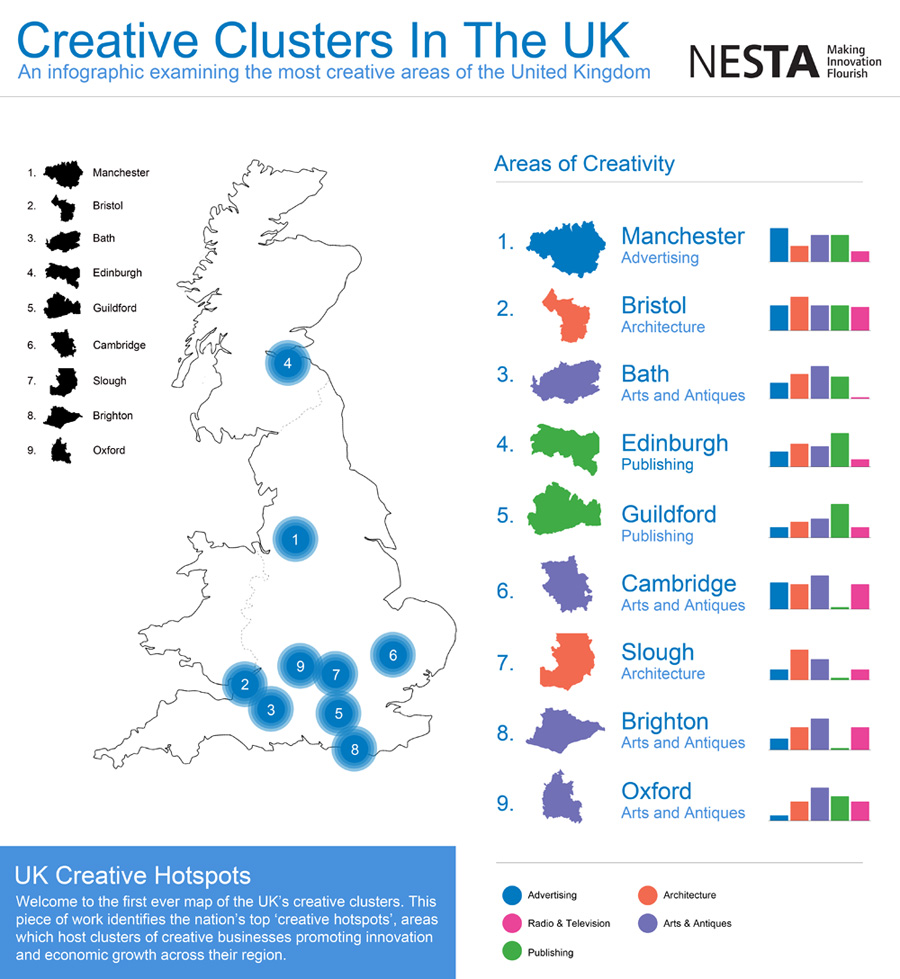
Creative hotspots
London is at the heart of the creative industries in Britain, dominating in almost all creative sectors, and particularly in the most intrinsically creative layers of the value chain for each sector.

The nine other creative hotspots across Britain are Bath, Brighton, Bristol, Cambridge, Guildford, Edinburgh, Manchester, Oxford and Wycombe-Slough.

Different cities across Britain have different profiles of creative specialisation: cities across the South present more diversity in their range of creative services, whereas Northern and Midlands cities (Manchester excepted) have similar creative profiles.

However, the mere existence of a creative agglomeration is not enough for the benefits from clustering to emerge. The other crucial ingredient is connectivity between firms within a cluster, with collaborators, business partners and sources of innovation elsewhere (both in the UK and overseas), and finally, with firms in other sectors that can act as clients, and as a source of new and unexpected ideas and knowledge. These three layers of connectivity are underpinned by a dense web of informal interactions and networking.

NESTA’s report identified a range of proactive steps that can be taken to help boost creativity internally, locally and nationally;

Look for latent clusters rather than try to build new ones from scratch
Identify whether there are any latent clusters ‘hidden’ in your locality that would benefit from networking and awareness-raising to develop a dense web of internal and external links.

Think about which sectors work well together
There are important synergies between some creative sectors, but not others. Avoid potentially wasteful ‘one-size-fits-all’ strategies for creative clusters that don’t pay sufficient attention to the distinctive needs of different sectors.

Adopt better targeted, and more realistic strategies that focus on ‘building up and connecting’ those sectors that are already present – and are complementary with each other.

Technological innovation is increasing the potential impacts from the creative industries…
The creative industries do not have a monopoly on creativity, but neither do manufacturing and engineering have a monopoly on technological innovation.

Universities should do more to promote innovation in increasingly tech-intensive creative industries
Technology intensive creative industries, for example, have something to gain from tapping into the public research base in their local universities.

In the context of the creative industries, universities tend to be seen mainly as a source of skilled labour. This contrasts with the technology and science-based sectors, where universities are a crucial source of knowledge for innovation, as well as high-growth spinoffs. It is important to ensure that the local creative industries engage more actively with universities to harness research outputs that might enhance their productivity and innovative performance.

Nurture talent, and give it reasons to stay
The presence of a specialised and knowledge-intensive pool of labour is a key factor in business.

Help remove barriers to collaboration
Even if they are aware of each other, local creative businesses may be keen to protect their valuable ideas or client portfolios and be wary of collaborating for fear of disclosing sensitive information.

Capture creative value locally

The generation of original intellectual property (IP) is at the core of what many creative businesses do. Where they retain ownership over their IP, they have more incentives to innovate to exploit it, generating additional revenues that can be reinvested in growth, and building commercial and collaborative relationships with other local firms.

Build bridges as well as towers
Although investments in iconic public buildings can produce undoubted cultural and economic benefits, building links between potentially collaborative businesses and sectors may produce longer lasting impacts.

East London Tech City as the beginning of a new approach for creative cluster development?
The Prime Minister’s announcement (in November 2010) of the East London Tech City set of initiatives, aimed at building up the vibrant high-tech and digital media cluster in Old Street and Shoreditch is a step in the right direction. Rather than trying to create a new cluster from scratch, East London Tech City aims to take an organic, already competitive cluster to the next level, by providing it with the right infrastructure (both physical and digital), and developing its connections with global companies.

Monday 7 February 2011

Ideas

Visual communication depends on creativity taking place with a framework. You can’t give your imagination free reign because you have to come up with ideas about your subject in a context that will not confuse the receiver.

But working with a framework need not stifle creativity. Restrictions provide something to react against, or a tradition to break. The challenge is in pushing the boundary but not necessarily exceeding it.

Most people would agree that creativity means challenging conventions and producing, or being open to, new ideas. Of combining things that are not normally associated together in different or unexpected ways to create something new and exciting.

A good idea is a thought that may offer a new overview of a communication problem, or a starting point for a new solution. Often it adds something new to the message through the wording or design.

A successful idea captures attention and invokes an emotional response. It should be simple and clear and have the capacity for further development.

Practical creativity often follows a familiar pattern that starts with an insight to the nature of the communication problem to be solved, establishes and clarifies the goals that you are trying to achieve, involves a period of desk research or mystery shopping to understand the context of the problem and the target audience, before finally generating ideas and reviewing their value and currency.

Thinking laterally about applying new information or providing a different context to your message is important in creativity. Avoiding habitual solutions by finding a new perspective or angle on a familiar problem allows the creative thinker to see things in a new light.

But where do ideas come from? There are two levels of dialogue that can take place, internal within the creative mind and external with your colleagues. Unlocking those dialogues involves breaking strong forces of internal and external habit. Everyone must feel able to think and to voice ideas that may be unworkable or plain daft.

Tricking your brain into avoiding self-censorship for fear of criticism or rejection often involves using creative tools or role-play. These techniques may include;
  • Brainstorming – Ideas by association where all suggestions are welcome
  • Nine boxes – your problem in the middle, eight possible solutions around the outside. Take each idea in turn and repeat.
  • Opposites – ideas using opposites and conflicts
  • Six thinking hats – Edward de Bono’s classic methodology
  • Sketching – drawing often triggers new ideas
  • Starting at the end – work backwards to discover the prerequisites for success
And finally, there’s your idea, ready to be developed and tested and grown into a full creative solution.

As an untried solution to a problem, your idea only becomes meaningful when it is applied to the communication problem. But when your idea successfully addresses problem, is in line with the goal of your client, reflects the vision and values of their business and is capable of being deeply embedded in all communication channels, then you have your creative solution.

Wednesday 19 January 2011

This is Tomorrow

And so to the Whitechapel Gallery to see This is Tomorrow, an account of the production process of this seminal exhibition.

During the 1950s mass production and new technologies were celebrated by the Media. Novel materials were to influence all areas of life, from the daily maintenance of living spaces and the built environment as well as the production of art.

Architect, writer and founder member of Pentagram Theo Crosby’s initial idea for an exhibition involving architects, artists, designers and theorists resulted in This is Tomorrow, which took place at the Whitechapel in 1956 in collaboration with members of the Independent Group. The theme was the ‘modern’ way of living and the exhibition was based on a model of collaborative art practice. The 38 participants formed 12 groups, which worked towards producing one artwork.

Just What Is It that Makes Today’s Homes So Different,
So Appealing? © Whitechapel Gallery
  
One of the group members, Richard Hamilton, produced his 1956 collage Just What Is It that Makes Today’s Homes So Different, So Appealing? for the exhibition. It is considered by critics and historians to be one of the early works of Pop Art.

An iconic show in its conception and realisation it has continuously interested artists, theorists and curators ever since due to the challenge it posed for the creative practitioners and visitors alike. The former, as each group was formed by an architect, a designer, an artist and a theorist, were requested to amalgamate their individual approaches and produce a work by deploying a new methodology. The public, with no interpretation panels and other information available, had to make their own judgements as to how to navigate inside the gallery and interpret the works they viewed.

Messaging

According to the New York Times, the average person is subjected to over 5,000 advertising messages a day. The more messages we perceive, the greater the background noise.

The more you shout, the more noise is created. Everybody wants to be heard. Everybody shouts. To rise above the noise, you need to shout louder.

Or do you?

What your clients need is a message that cuts through the noise, even if you only whisper.

Formulating and structuring your message is therefore critical to making sure you are heard.

Needs
Establishing the needs of your target group – and therefore the types of messages that are likely to resonate with them – is a key component of your message.

Maslow expressed his triangular hierarchy of needs in 1954. Basic physical needs form the base of the pyramid. Once these are satisfied, people’s desires move up to the next level, safety needs, and then social, esteem and self-actualisation at the apex. We move up and down through these levels depending on our lifestage and circumstances.

To be successful, messages, goods and services need to be aligned with the needs of your target audience at their appropriate lifestage.

For instance, expensive makeup is neither a physiological, safety nor social need. Loreal plays on esteem needs of the professional woman with disposable income ‘because you’re worth it’.

Arguments
Rather than shouting louder, it is better to convince a person with a series of statements establishing your proposition.

That’s right, you came here for an argument.

The first stage in an argument is to delimit the terms of reference. What is in and what is out. Provide too much unnecessary information and your audience gets bored.

Then there has to be a structure to the message to make it worth listening to; a narrative with a beginning, middle and end; a dialogue; a setup and a payoff.

The actual message itself can consist of a primary argument (eating 5 portions of fruit and vegetables a day is healthy) and secondary arguments (fruit and vegetables are cheap and easy to prepare) that help convince the receiver by supporting the main argument.

The optimum message is based on the primary argument, but where there are several supporting arguments, the strongest one is normally used first with the second strongest left until last and the weakest ones in between.

Both primary and secondary arguments may appeal to logic (health benefits) or emotion (better skin tone) to get their point across. However, whilst the receiver can be convinced by rational arguments, logic is no more important than emotion in decision-making.

This is because the receiver firstly identifies with and adopts a position on your message. Based on the position takes, the receiver then filters all the arguments and counter-arguments. If the pros outweigh the cons, then a subconscious decision is made and the receiver rejects the opposition position. In essence, the receivers convince themselves of the course of action to take.

Generally arguments are one-sided, as the receiver can be relied upon to provide the subvocalised opposition. However, two-sided arguments, where the sender expresses the disadvantages as well as the advantages of their position, can suggest honesty and integrity.

Finally, it is important that your audience feels involved and proactive in the messaging process. Your story leads the way, but by allowing the receiver space to work out your message for themselves, they are more likely to come to the desired conclusion.

Aligning your message with the needs of your audience and developing a clear argument gives you the cut-through that you need and the best chance of being heard.

Tuesday 11 January 2011

Perception II (discernment)

In previous posts I looked at some theoretical tools to refine and improve messaging. Among these, some of the more practical ones are chunking, perception, scanpaths, wayfinding and content structure;

In perception, there are two key structures involved, difference and discernment.

Discernment and Gestalt pschology
Adjacent objects are generally perceived and processed as a group and considered to have a like meaning. Objects which share similar attributes – size, colour, shape, direction – are also perceptually grouped together.

Grouping objects to create contextual relationships and create implied alignments helps a designer to guide the viewer’s eye through the content.

These principles of perception are explored in the theories of Gestalt psychology, that examine ‘the essence or shape of form’. The phrase ‘The whole is greater than the sum of the parts’ is often used when explaining Gestalt theory.

Fundamental to Gestalt are the laws of Pragnanz, which state that we tend to order things in a manner that is regular, ordered and symmetric;
  • Principle of closure – the viewer infers elements in order to complete a regular figure
  • Principle of similarity – the viewer groups similar elements together
  • Principle of proximity – spatial proximity induces the viewer to perceive a group
  • Principle of symmetry – symmetrical images are perceived by the viewer as a group even if separated by distance
  • Principle of continuity – The viewer infers continuing patterns
  • Principle of common fate – Elements with the same direction are perceived by the viewer as a group

Gestalt psychology is frequently used in user interface design, for example where text fields and buttons are placed with reference to the laws of similarity and proximity.

Designing familiarity in to layouts through consistent placement of similar types of content creates a rhythm and flow in your designs that allow the viewer to process information quickly and efficiently.

Perception I (difference)

In a previous post, I talked about how designers transmit knowledge, share concepts and process information through language, and how structure and legibility affect the visualisation of messages and inform the design decisions you make on a daily basis.

To help your audience understand your messaging, you need to know how they will receive and decode the information you send.

Scientific study has provided designers with a number of theoretical tools to refine and improve their messages. Among these, some of the more practical tools are chunking, perception, scanpaths, wayfinding and content structure.

In perception, there are two key structures involved, difference and discernment.

Difference threshold and Weber’s Law
Understanding our ability to perceive information and distinguish one information set over another can help designers target their messages for maximum impact.

Weber’s Law of Just Noticeable Differences (no, really!) suggests that there is an identifiable minimum amount of change that can be defined for a viewer so that they are able to notice a difference in any one design

If the amount of perceptual change remains a constant (and can thus be predicted unconsciously by the viewer), then it is easier for your audience to process and distinguish between different types of information. This regular rate of change is known as the ‘difference threshold’.

Weber’s Law can be used to help designers make constructive choices in making information follow an obvious hierarchy.

For example, setting a consistent rule for the differential sizing of type headings, say in 4 point increments, establishes a clear information hierarchy in the mind of the audience.

Similarly, decisions on the relative weights of fonts in typeface design can also be informed by identifying the difference threshold.

User testing of visual assumptions against Weber’s Law can help confirm the designer’s intuition regarding aesthetic considerations and help establish clearer communication with the audience.