Thursday, 26 May 2011

Effective images

How images are framed depends on the overall look and feel that the designer is trying to achieve, but there are various ideas that photographers – and painters – have found useful in creating effective images.

The selection, sizing and cropping of images is directly related to the accompanying text, in that they are either designed to illustrate the text, or the text provides an explanatory note to the image.

A common mistake is to use an image as it is provided, resulting in the use of poorly composed shots without a clear focal point or direction. Wheras any image can be made to work harder if the composition of subject elements is manipulated to communicate effectively with the intended audience.

There should be a good reason behind every image you select. Ask yourself;
  • Is your chosen image relevant and meaningful to the audience?
  • Is it right for the task and does it make the accompanying words work harder?
  • Will the combination of the words and pictures get the reader thinking?
  • Will the choice of image provoke the reader to do what you want them to do?
Designer and editor should work with a selection of close-ups, mid and long-range images. They should look to engage more directly with the subject matter and create interest through cropping, using orientation, symmetry or asymmetrical composition and the rule of three.

Cropping
Cropping is the easiest and most effective way to edit an image. This can change the whole emphasis of the shot by removing extraneous or distracting subject matter and manipulating the relationship between the subject elements and the edge of the frame.

Conversely a poor crop can ruin a good image. Be careful not to end up with a crop that is just slightly rectangular, as this communicates a sense of indecision.

Orientation
Picture shapes are normally dictated by the natural arrangement of elements. Landscape images tend to emphasise the relationship between subject elements to the left and right of the frame, whilst portrait images tend to relate background to foreground.

Choosing a landscape format for an image of a person, or using a portrait format for a landscape can produce an unexpected effect or pleasing juxtaposition.

Composition
People are predisposed to prefer symmetrical composition and this is the starting point for editing any image, placing the subject central in the frame. This signifies stability and strength.

However, symmetry can become monotonous and can lack movement. Asymmetrical composition places the subject off centre to create a more dynamic image with tension between the contrasting spaces around the subject.

The rule of three
The rule of three is a useful rule of thumb for asymmetric composition. Dividing the frame into vertical and horizontal thirds creates four ‘sweet spots’ at the intersections of the gridlines. Placing the most important elements of the image on or adjacent to these intersections can transform an ordinary image into one with a stronger composition.


Original image
Image divided into thirds
Image recropped with the subject positioned adjacent to the top right gridline intersection

Using these simple tools, a designer and editor can manipulate images in a structured way and get the most out of their pictures.

Thursday, 28 April 2011

Wim Crouwel at the Design Museum

If you get the chance, take an afternoon out to visit the Design Museum where the Wim Crouwel retrospective is showing until July.

Regarded as one of the leading designers of the twentieth century, Crouwel embraced modernist principles, producing a wide range of typographic designs that influenced the course of graphic design through the 50s and 60s and continues to have resonance today.

Heavily influenced by the Bauhaus and the modernist design work of Jan Tischold and Josef Muller-Brockmann, Crouwel’s initial work as an exhibition designer gave him a great sense of spatial awareness that he brought to his poster and programme designs, first for the Van Abbe Museum in Eindhoven, and later for the Stedelijk Museum in Amsterdam.

Wim Crouwel's work at the Design Museum
Gifted with a sympathetic museum director who allowed him the freedom to develop a signature look, Crouwel developed a structured grid system which acted as a unique template for the Stedelijk Museum's graphic identity. The logic of his designs distil the subject down to its absolute essence, yet often the poster layouts contain an experimental element or visual pun, playing off the exhibition title or the subject artist's style.

In 1963 Crouwel founded the multi-disciplinary design agency Total Design creating the identity for numerous Dutch companies, working for clients such as IBM, and typeface commissions for Olivetti. He was instrumental in leading a controversial redesign of the dutch telephone book using only lowercase letters - offering major savings on ink and paper - but one which failed to find favour with its audience.

New Alphabet (redrawn)
Whereas his strength lay in designing one-off grid-based posters and wordmarks, primarily supported by easily readable sans serif type, his interest in letterforms as graphic objects led Crouwel to design the radical New Alphabet typeface as a visual experiment. Based on the look of type as seen in emerging computer systems, it appeared almost alien, a cipher script of vertical and horizontal lines. This almost Illegible font challenged the design establishment and provoked debate amongst modernists - a debate which Crouwel was happy to engage in - openly admitting to placing visual aesthetics above function.

(Although never meant to be really used, New Alphabet was subsequently redrawn by Brett Wickens and Peter Saville for the Joy Division album, ‘Substance’ in the late 80s.)

Some of his work has dated, but there are many pieces that still retain a freshness and vitality and demonstrate a clarity of thought. Set beside contemporary work by design groups 8vo, Cartlidge Levine, Studio Myerscough and Peter Saville, the influence and legacy of Wim Crouwel can be clearly seen.

Thursday, 7 April 2011

Structured writing

Be clear what you want your writing to say before you start to write it.

What impression are you trying to create? Are you just giving information, or do you want your readers to do something? Who is your audience? Who will read your writing? Think about these groups, what interests them and what you want to say to them. How do they like to receive and use information? Is the visual impact important to them or not?

Inverted pyramid writing
Most people are taught to write by setting up a proposition, building an argument and coming to a conclusion.

However, this presupposes that your reader has the time to read your content all the way through to the end. However, most people skim and scan text in order to extract the salient points as quickly as possible.

Journalists and web editors recognise that their readership is transient and have adopted the concept of inverted pyramid writing to communicate with a time-poor audience.

This style places the most newsworthy information at the beginning of the story and orders the remaining content based on relative importance.
  • Story lead (who, what, why, where, when) > Supporting information > Details
Using this structure enables the viewer to grab the core message quickly. In turn, your design should clearly frame the content and enable skimming and scanning.

Writing for the web
People don’t read websites in the same way as they read books or newspapers. They tend to scan, looking for the information they want, and ignore long documents and large blocks of text. You can make it easier for your users by following a few simple pointers:
  • Put the most important information at the top of the page
  • Use sub-headings, bullet lists and links, so people can find topics easily
  • Use plain English and avoid jargon (remember, you are writing for everyone, including people whose first language may not be English)
  • Keep it brief – internet users like short bites of text
  • Keep pages short – don’t make people scroll down too far on any page. 
  • Use short sentences
  • Make sure your content is relevant – do I really need to include this?

Tuesday, 15 March 2011

Bass notes: Saul Bass at London's Kemistry Gallery

Saul Bass is acknowledged as one of the 20th century’s most successful corporate designers, responsible for (amongst others) the logos and identity systems for AT&T, United Airlines, Alcoa and Warner Communications.

Bass’s work is instantly recognisable for its directness, its simplicity and the way it makes its meaning felt. Breaking all conventions in the 1950s and 60s, Bass virtually invented film titles as we know them today, and he was the first to synthesize movies into compelling trademark images.

Looking at his poster designs on display at the Kemistry Gallery, I wondered how much his style was driven by the silk screen process and the need to reduce the visual idea down to it's simplest, most expressive components.

His later posters were more colourful and visually complex, yet seemed to have less impact.

In a period when graphic imagery can be easily manipulated electronically, Bass reminds us that to cut through the visual clutter, a strong idea is always at the heart of a great design.

Tuesday, 8 March 2011

Structured content

The organisation of content directly affects our ability to receive a message.

Some people want to know all the details, others just require a general understanding. Structuring information in a way that provides the viewer with multiple levels of understanding is a fundamental principle of communication design.

Will the editorial approach be story, news or feature? Narrative or bullet point? Q&A or monologue?

Understanding the structure of your content, having an overview of the likely sequence of content types and applying the LATCH and AIDA communication models will help you to structure your design.

LATCH and AIDA structural models
There are two standard models for organising content. Created by Richard Wurman, LATCH (Location, Alphabet, Time, Category, Hierarchy), identifies five key ways to categorise information and is generally used at the document level. AIDA (Attention, Interest, Desire, Action), Developed by E St Elmo-Lewis describes the sales process and is a generally used in advertising and at the story level in narrative.

LATCH (Location, Alphabet, Time, Category, Hierarchy)
  • Location - Structures information based on spatial positioning ie. transport guides, the human body. Use location when physical connections are important to understanding.
  • Alphabet - Organises content structure on letter sequence. Use the alphabet when seeking a structure that will be broadly familiar to a diverse audience.
  • Time – Chronological frameworks should be used when users need to understand a sequence of events ie. calendars, timelines.
  • Category – Group together information with similar features or attributes. Organise data by category when you need to emphasise connections between data sets.
  • Hierarchy - Organise information by measure or perceived importance. Use when assigning weight or value to information.
These categories are not mutually exclusive. For instance, a newspaper is divided into different categories; business, sports, arts etc. Within these sections, editors use hierarchy to place stories in order of perceived importance. The obituary section is ordered alphabetically, whilst the sports results are listed chronologically and weather is mapped by location.

AIDA (Attention, Interest, Desire, Action)
  • Attention or awareness must be developed so that the audience is aware of the product or service.
  • Interest must be generated so that the audience learns more about the offer.
  • Desire must be created, evoking an emotional response.
  • Action is then taken.
For example, in a magazine article or advert you grab attention through an engaging image or arresting headline. The copy creates interest in and desire for the product or service. Finally, the call to action prompts the viewer to act.

You can see that the AIDA model can be used most effectively if you fully understand the needs of your customer or end users.

Tuesday, 1 March 2011

Creative clusters and innovation

Putting creativity on the map

NESTA research report 2010

NESTA is the National Endowment for Science, Technology and the Arts - an independent body with a mission to make the UK more innovative. NESTA invests in early-stage companies, informs policy, and delivers practical programmes that inspire others to solve the big challenges of the future.

Their report into Creative Clusters, published in November 2010 makes interesting reading for both businesses looking to foster creativity within their organisations, as well as policy makers and planners looking at creativity locally and nationally.

The creative industries are a force for innovation at the national, regional and organisational level. At 6.2 per cent of the economy, and growing at twice the rate of other sectors, the economic importance of the creative industries to the UK are proportionately the largest of any in the world. Nurturing high-technology clusters can also be seen as a way of rebalancing the economy away from the construction and financial services sectors.

The UKs creative industries are more innovative than many other high-innovation sectors, providing a disproportionate number of the innovative businesses in most parts of the country. Analysis of the innovation performance of Britain’s creative industries confirms that they punch well above their weight in terms of innovation across almost all regions in the UK.

NESTA took the concept of creative clusters as a starting point to examine the role that creative industries play in local and regional innovation systems.

Industrial clustering benefits businesses by giving them access to skilled staff and shared services, and the opportunity to capture valuable knowledge spillovers.

Creative firms tend to locate close to each other even more than
most other sectors. Advertising and Software firms often cluster near each other; the same is true of Music, Film, Publishing and Radio and TV businesses.
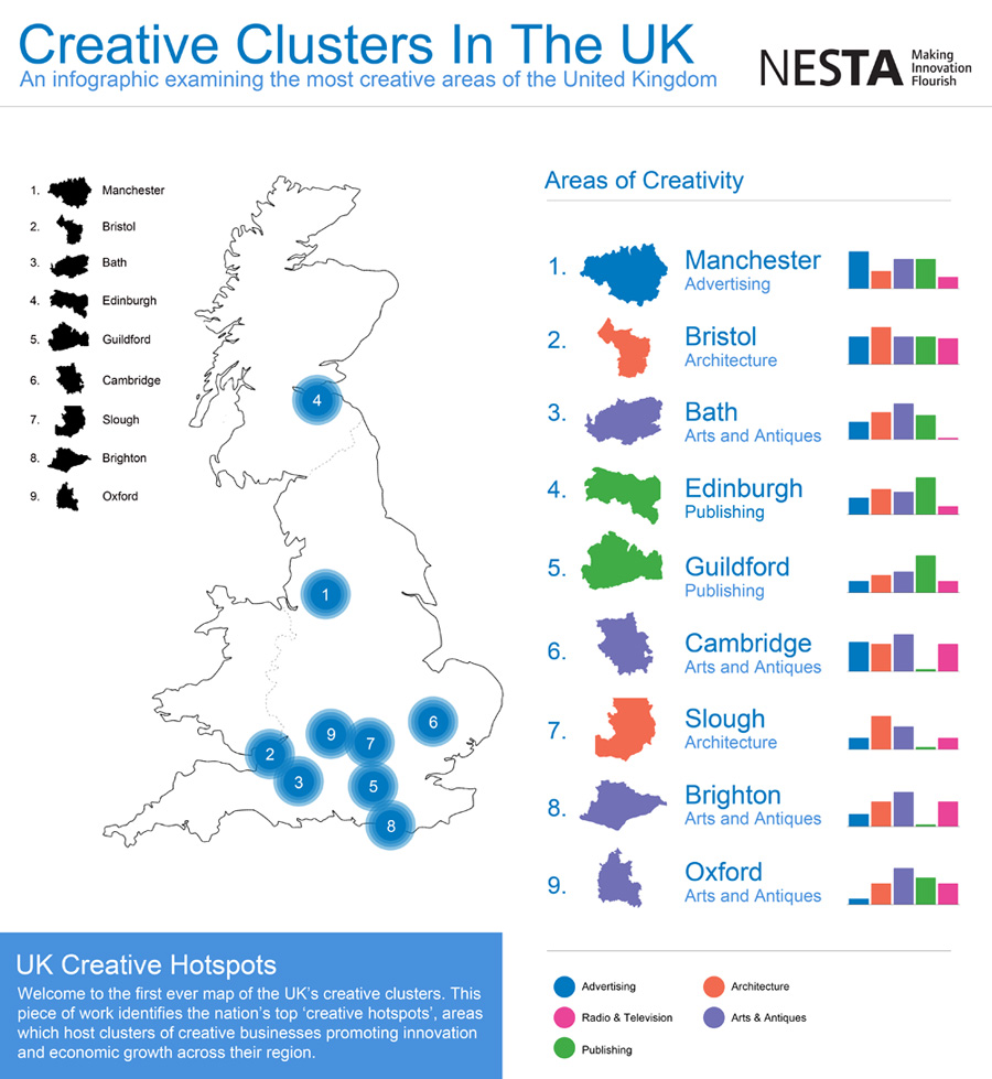
Creative hotspots
London is at the heart of the creative industries in Britain, dominating in almost all creative sectors, and particularly in the most intrinsically creative layers of the value chain for each sector.

The nine other creative hotspots across Britain are Bath, Brighton, Bristol, Cambridge, Guildford, Edinburgh, Manchester, Oxford and Wycombe-Slough.

Different cities across Britain have different profiles of creative specialisation: cities across the South present more diversity in their range of creative services, whereas Northern and Midlands cities (Manchester excepted) have similar creative profiles.

However, the mere existence of a creative agglomeration is not enough for the benefits from clustering to emerge. The other crucial ingredient is connectivity between firms within a cluster, with collaborators, business partners and sources of innovation elsewhere (both in the UK and overseas), and finally, with firms in other sectors that can act as clients, and as a source of new and unexpected ideas and knowledge. These three layers of connectivity are underpinned by a dense web of informal interactions and networking.

NESTA’s report identified a range of proactive steps that can be taken to help boost creativity internally, locally and nationally;

Look for latent clusters rather than try to build new ones from scratch
Identify whether there are any latent clusters ‘hidden’ in your locality that would benefit from networking and awareness-raising to develop a dense web of internal and external links.

Think about which sectors work well together
There are important synergies between some creative sectors, but not others. Avoid potentially wasteful ‘one-size-fits-all’ strategies for creative clusters that don’t pay sufficient attention to the distinctive needs of different sectors.

Adopt better targeted, and more realistic strategies that focus on ‘building up and connecting’ those sectors that are already present – and are complementary with each other.

Technological innovation is increasing the potential impacts from the creative industries…
The creative industries do not have a monopoly on creativity, but neither do manufacturing and engineering have a monopoly on technological innovation.

Universities should do more to promote innovation in increasingly tech-intensive creative industries
Technology intensive creative industries, for example, have something to gain from tapping into the public research base in their local universities.

In the context of the creative industries, universities tend to be seen mainly as a source of skilled labour. This contrasts with the technology and science-based sectors, where universities are a crucial source of knowledge for innovation, as well as high-growth spinoffs. It is important to ensure that the local creative industries engage more actively with universities to harness research outputs that might enhance their productivity and innovative performance.

Nurture talent, and give it reasons to stay
The presence of a specialised and knowledge-intensive pool of labour is a key factor in business.

Help remove barriers to collaboration
Even if they are aware of each other, local creative businesses may be keen to protect their valuable ideas or client portfolios and be wary of collaborating for fear of disclosing sensitive information.

Capture creative value locally

The generation of original intellectual property (IP) is at the core of what many creative businesses do. Where they retain ownership over their IP, they have more incentives to innovate to exploit it, generating additional revenues that can be reinvested in growth, and building commercial and collaborative relationships with other local firms.

Build bridges as well as towers
Although investments in iconic public buildings can produce undoubted cultural and economic benefits, building links between potentially collaborative businesses and sectors may produce longer lasting impacts.

East London Tech City as the beginning of a new approach for creative cluster development?
The Prime Minister’s announcement (in November 2010) of the East London Tech City set of initiatives, aimed at building up the vibrant high-tech and digital media cluster in Old Street and Shoreditch is a step in the right direction. Rather than trying to create a new cluster from scratch, East London Tech City aims to take an organic, already competitive cluster to the next level, by providing it with the right infrastructure (both physical and digital), and developing its connections with global companies.