Showing posts with label Social. Show all posts

Thursday, 21 September 2017

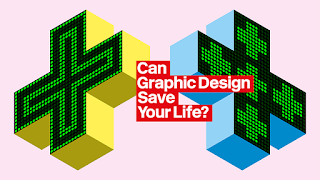
Can Graphic Design Save Your Life?

And so to the Wellcome Collection, and their exploration of the relationship between graphic design and health Can Graphic Design Save Your Life?.

The exhibition highlights the widespread and yet subliminal nature of graphic design in constructing and communicating healthcare messages; words and images, signs and symbols, colour, scale and format, all carefully structured to communicate, and in doing so shaping our environment, society and personal health.

Creating a health message that an individual is willing to self-identify with, and consequently inspire action or change their behavior, requires a range of design interventions. Surprisingly, sometimes a small structural change can create the greatest impact.

For example, ‘nudge’ theory suggests that presenting people with a mandated choice or opt-out question makes it significantly more likely that they would choose to carry an organ Donor card.

The exhibition is divided into zones; persuasion, education, hospitalisation, medication, contagion and provocation.

Each of which explain one aspect of design in health, from national public awareness campaigns such as those for AIDS (TBWA) and the Samaritans (BBDO), to design research such as the NPSA’s findings on improving pharmaceutical packaging design and patient safety (RCA’s Helen Hamlyn Centre for Design).

I enjoyed seeing Dr. John Snow’s historic map of cholera deaths around the Broad street pump, and Florence Nightingale’s ‘rose’ charts to illustrate deaths from disease in the Crimea, classics of information design.

On a larger scale, the sympathetic A&E information and wayfinding system for the NHS (Pearson Lloyd) and the now ubiquitous emergency service ‘battenburg’ patterns (PSDB) are reminders of how effective design ideas quickly spread and become an accepted part of the environment.

Whether taking the correct tablet, deciding to donate an organ or to practice safe sex, graphic design influences our health and wellbeing. Can Graphic Design Save Your Life? considers just how vital graphic design can be.


Saturday, 19 November 2016

Type talks

We know that typefaces convey emotion as well as information.

Sarah Hyndman’s talk at the Museum of Packaging set out to explore the connections between social change, popular sentiment and typography.

In a time of increased industrialisation and globalisation, where jobs and livelihoods are threatened, where an influx of labour from elsewhere depresses wages, where old certainties are stripped away as financial systems, social order, and country borders are threatened. New leaders articulate a radical vision of the future, whilst those outside of the elite look on powerless and in search of a voice.

Sound familiar?

In 1970 the raw anger of a generation that felt excluded, marginalised and ignored found their voice in Punk. Expressed through attitude, music, style and typography, Punk’s anti-establishment stance found its visual expression through the work of Jamie Reid.

The stylistic conventions of Punk included mixing type styles and weights, overprinting, cluttered pages, deliberate mistakes, cultural references, blurred photography and an embrace of general messiness. All elements that rejected the rules and structure of the international style, took the typographic grids of modernism, a visual shorthand for the corporate industrial complex, and tore them apart.

Treating type as if it was a photograph freed designers from the restrictions of typesetting within a structured grid. Cut-out, photocopied and hand-drawn type also had the advantage of being able to bypass expensive printers, the rawness of the layouts on labels, flyers and zines perfectly matching the urgency and language of the authors.

 Ironically, the vibrancy of the look led to it becoming co-opted by the very establishment that Punk aimed to subvert. First ignored and feared, then embraced and tamed.

Kellog’s Squares anyone?

The creation of an expressive style that symbolises opposition to the establishment has historical precedent, and the inevitable co-option of anti-establishment typography into the mainstream follows a similar pattern. First World War Germany saw the appearance of Dadism. 1960’s America brought us psychedelia and pop art against the backdrop of the Vietnam war. The industrial decline of The UK in the 1970’s gave rise to Punk, whilst the 1980’s brought New wave and the postmodern typographic design of Brody, Saville, 8vo and Tomato (amongst others).

And so to 2016, and the rise of the Snapchat generation. With one typeface, limited tools and only a 10 second viewing window, Snapchat is the latest medium for millennials to share the moments that matter to them. it’s really immediate and ugly. You’re not designing, it’s just Times New Roman or Ariel and then it’s gone. It’s the closest thing now to how Punk looked like then.

Unstructured information and emotion that is explicitly short-lived and self-deleting, so it can’t be filtered, searched, indexed or saved, but provides today's authentic voice.

Thursday, 13 October 2016

Noto

Photo: Andy Dunn
Noto, Google’s multi-language font family from Monotype is designed to work over a wide range of different languages and on any device.
 

Noto covers more than 800 languages and 100 written scripts, and includes serif and sans serif fonts across eight weights as well as numbers, emoji, symbols, and musical notation.
 

The result of a five-year collaboration between Google and Monotype, one of the main aims for the typeface is to allow cultures to communicate digitally and help enable global communications across borders, languages and cultures.
 

Monotype has researched and digitally designed the characters, writing systems and alphabets for each Noto typeface, applying the rules and idiosyncrasies for individual languages to the fonts, based on the Unicode standard – a character coding system that defines the characters and languages that can be displayed and used within a computer system.
 

Because new scripts are constantly being added to Unicode, when a computer is unable to display a character in a font, it displays blank boxes instead. These are colloquially known as “tofu”. The name Noto is taken from Google’s goal of having “no more tofu”.

Monotype linguistic typographer Kamal Mansour says: “The aim of the Noto project is to provide digital representation to all the scripts in the Unicode Standard. That in particular is something that many different language communities could not afford to do on their own.”

Wednesday, 13 May 2015

Google Mobile App UX Principles

I do like a good UX framework, and Google’sMobile App UX Principles document uses practical examples to demonstrate how to improve the user experience of apps. The effectiveness of user optimisation strategies are illustrated using metrics such as app performance and user conversion on both Android and iOS platforms.

Adopt, Use, Transact, Return
In designing an app, you need to work hard to meet the expectations of users who are becoming accustomed to high quality apps that deliver usable, robust, and sometimes delightful user experiences.

Investing time and effort in creating, testing and optimising services can have a significant effect on how ‘sticky’ your app becomes.

The basics that need to addressed include optimising conversion, and avoiding interrupting users, or forcing them to think about things that should be simple. Google expresses this as a four-stage ‘Adopt, Use, Transact, Return’ framework.

Adopt, Use, Transact, Return

Adopt - Remove roadblocks to usage  
Remove all roadblocks to usage - and adoption - of your mobile app. Get users into the content / substance as quickly as possible, so that they can use, assess and experience its value to them.

First impressions count, and a splash screen gives you a short but vital window to engage a user in your proposition. But, never make users wait.

Tips / help or an onboarding sequence should only be employed if really necessary - so as not to interrupt users - but when used appropriately at key decision points, tips/help can guide the user in their initial experience and adoption.

Use - Make conversion decisions simple  
Enable people to use your app in the way that suits their needs. A clear structure combined with an excellent search facility using a range of methods, from keyword to product scanning and image search, will help users find what they want quickly and easily, satisfy their needs and drive conversion.

Transact - Provide the ultimate in convenience
Help users progress through each checkout stage with minimal effort, and with sufficient reassurance, to convert without hesitation.

Return - Self service, engagement and delight
Be useful, to engage and delight, in order to retain customers or encourage member loyalty. Because, mobile apps are the most appropriate touchpoint for repeat interactions and frequent transactions, customers and members already loyal to a brand, and mobile first use cases (that couldn’t exist without unique smartphone services leveraging rich and contextual data; etc.), are more likely to return if an app provides an engaging experience.


What not to do


Do not mimic UI elements from other Platforms 
Design for each native mobile platform – Android and iOS - because each has unique capabilities and visual languages

Do not use underlined links 
Avoid using text with underlined links, which are part of the web / browser / page model, and not part of the app / screen model. Apps use buttons, not links.

Do not take users to the browser
Keep users in-app at all times, to maintain their spatial geography and to optimise conversion.

Do not ask users to rate your app too soon after downloading it
Avoid interrupting users by asking them to rate your app if they’ve only recently downloaded it or only used it a few times. Instead, wait until they prove to be repeat users and they’ll be more likely to rate your app favourably and provide more informed feedback

Tuesday, 21 April 2015

Mobile-friendly

My portfolio website at www.robertlevison.co.uk passes Google's mobile-friendly website test. Yay!


"Mobile friendliness" will affect how prominently websites appear in Google search results pages from 21 April 2015.

A page is eligible for the “mobile-friendly” label if it meets the following criteria as detected by Googlebot:
  • Avoids software that is not common on mobile devices, like Flash
  • Uses text that is readable without zooming
  • Sizes content to the screen so users don't have to scroll horizontally or zoom
  • Places links far enough apart so that the correct one can be easily tapped
Google provides a Mobile Friendly Test developer tool so you can see if your website is mobile-friendly.

Friday, 16 January 2015

Are Annoyingly Literal Headlines Set In Title Case Optimised For SEO?

You can find them across the web, headlines written for search engines rather than readers.

Online magazines like DesignTaxi and news aggregator sites such as BuzzFeed and Huffinton Post use strangely formulaic headlines, typically including a keyword, a proper noun, a verb, and an adjective whilst avoiding simple connectives. It’s English, but not as we know it. In SEO terms the language is optimised to add ‘value’ to each headline.

But in writing for robots, you just get robotic headlines.

It’s hard to imagine classic newspaper headlines such as the Sun’s 1992 headline ‘GOTCHA’ having the same impact as ‘Royal Navy Stealth Submarine Sinks Argentinian Cruiser in South Atlantic’.

Probably the best (worst?) example is the Daily Mail Online, where the inclusion of multiple keywords in the headline means the headlines have become almost as long as the stories themselves. It's clickbait in its purest form. The logical conclusion of this process is that the headline becomes the story, just a shrieking top-line opinion seeking an instinctive knee-jerk reaction from the comment trolls.

Surely we can write better than this.

The point of SEO is to provide sufficient context for search engines to rank the story as high as possible in the search results, relative to the value of the content.

Whilst search engine algorithms are constantly being tweaked, it’s generally accepted that an editor can improve the page ranking of a story by crafting the relationship between the headline, page title and meta description.

As well as describing the story, the title needs to include a proper name and a likely keyword that the reader might be using in their search (towards the front of the headline if possible). The page title can expand on the headline, for instance using a full name when the headline just uses a shorter, well-known, shorthand (eg. Diana / Diana, Princess of Wales), whilst the meta description can include more detail for the ‘snippet’ displayed underneath the link in the search results. All three elements should aim to match the words that users are likely to use in their search, and these search-optimised keywords should also be included in the opening paragraph of the story.

Thinking more widely about the utility of the headline, fitting it within 156 characters to read fully in the search results makes it easier to circulate on social networks, and including a personal pronoun in the headline also improves the chances of readers sharing your story.

(There are of course other factors in SEO, such as unique links to the story and referring links from the story, but these are not necessarily part of the headline construction).

In 2009, usability expert Jakob Nielsen introduced the concept of writing short, snappy SEO friendly headlines that “…must be absolutely clear when taken out of context” and cited the BBC's website as a best practice example of headline-writing “…offering remarkable headline usability."

Nielsen claimed that BBC headlines have the following characteristics:
  • Short, typically 5 words or less
  • Information-rich
  • Include keywords
  • Understandable, even out of context 
  • Predictable/match for reader expectations
On the other hand, headlines from viral sites are usually the complete opposite:
  • Long, sometimes to the point of being rambling and incoherent
  • Emotion-rich
  • Few or no keywords
  • Typically non-contextual
  • Use shock or emotional language
And whilst there is value in using searchable terms, the results can be lost in translation.

The late advertising and copywriting genius, David Ogilvy, said that "On average, five times as many people read the headline as read the body copy.”

The point of a headline is to draw the reader into a story that they might not otherwise have read. The skill of the web subeditor is in knowing their audience so well that they can add their editorial tone of voice to the headline, whilst still capturing the imagination of the reader.

And if you can turn your headline into a pun, then so much the better.

The Scottish Sun’s ‘Super Caley go ballistic Celtic are atrocious’ is held up as one of the all time classic newspaper headlines.

And, although no one knew it at the time, it’s SEO friendly.
Tuesday, 29 April 2014

Just what was it about Richard Hamilton?

Just what is it that makes today’s homes so different,
so appealing?
Visiting the retrospective of Richard Hamilton at Tate Modern, I was struck by the way he constantly embraced new ideas in his art, and experimented with different drawing, painting, collage and printmaking methods and latterly digital techniques.

Hamilton took a very experimental approach to art, exploring the boundary between figurative and abstract images and the interface between organic and industrial forms.

In 1951, for his exhibition Growth and Form at the ICA, Hamilton used grid-based structures to look at form in nature and explore their influence on design trends in contemporary architecture and design.

In the seminal 1955 Man, Machine and Motion exhibition at the Hatton Gallery in Newcastle and then at the ICA, Hamilton arranged around 200 images in a modular steel grid. The viewer was encouraged to explore the installation and see images around, above and below them.

His developing interest in popular culture led to the creation of the collage seen as the first Pop art work, Just what is it that makes today’s homes so different, so appealing? Hamilton listed the characteristics of Pop art;
  • designed for a mass audience
  • transient
  • expendable
  • low cost
  • mass produced
  • young
  • witty
  • sexy
  • gimmicky
  • glamorous
  • big business
Effectively he was describing the next 50 years of modern advertising.


Sunday, 27 October 2013

Phonebloks

On Tuesday 29th October the Phonebloks video will ping across social networks 375 million times.

Phonebloks is a new concept for a mobile phone with a replaceable screen and easily moveable, changeable “bloks”, each containing a different element such as battery, chipset, gyroscope and so on that would give users a chance to choose from a range of components, and replace or upgrade them when necessary.

A phone only lasts a couple of years before it breaks or becomes obsolete. Although it’s often just one part that killed it, we throw everything away because it’s almost impossible to repair or upgrade.

The idea, by Dutch designer Dave Hakkens, came about when Hakkens realised that if a device could be taken apart and restructured more easily it would last much longer (and minimise electrical waste).

And so the idea of Phonebloks was born.

Phoneblok is made of detachable bloks. The bloks are connected to the base which locks everything together into a solid phone. If a blok breaks you can easily replace it; if it’s getting old just upgrade.

Bloks can be developed for specific needs. Solar powered batteries, sensitive screen for blind people, lightweight for travelers etc.

“Let’s say this is your phone and you do everything in the cloud - why not replace your storage blok with a bigger battery blok?” says Hakkens. “If you’re like this guy and love to take pictures, why not upgrade your camera?”

The bloks themselves would be available from a ‘Blokstore’, like an app store for hardware. In the store you buy your bloks, read reviews and sell old bloks. Small and big companies develop and sell their bloks. You can buy a pre-assembled phone or assemble it yourself by selecting the brands you want to support. The choice is yours.

And the platform can be adapted into other sizes to create new devices like tablets, cameras etc.

But at the moment, it’s just an idea.

For Phonebloks to happen, it totally depends on companies thinking there is a market for it, so the more people that are interested, the sooner companies start working on it.

Tuesday, 10 January 2012

*Santa*™

Its a bit late for this Christmas, but I came back to find a link to the Santa Brand Book from Quietroom in my inbox.

Ho, ho ho!

Tuesday, 6 December 2011

Behavioural science

Behavioural science and behavioural economics show us that, very often, we do not behave in ways we would expect to if we were perfectly ‘rational’ human beings. Many of us still have not insulated our lofts, despite the fact that doing so will reduce our energy bills; we very rarely switch our bank accounts, despite the fact that we may benefit from higher saving rates elsewhere; and we may not yet have committed to becoming an organ donor, despite the fact that the majority of us would be willing to do so if asked.

Many of today’s issues have a strong behavioural component. From tackling anti-social behaviour, to education and health – our behaviours as citizens, parents and neighbours significantly affect the quality of our lives and that of others.

We can influence people’s behaviour in a number of different ways. Tough laws can be made, with fines for those who fail to comply with new legislation, or bans can be introduced that prevent people from eating certain types of food or engaging in particular types of activities.

This is where advertising and design can make a difference. We can give citizens more or better information. We can prompt people to make choices that are in line with their underlying motivations. And we can help to encourage social norms around healthier behaviours in ways that avoid inadvertently communicating that the ‘problem behaviour’ – rioting or driving whilst using a mobile phone or dropping litter – is relatively widespread.

And, if we know anything from behavioural science, it is that behaviour is strongly influenced by what we think others are up to.

Governments, businesses and charities are using the behavioural change MINDSPACE framework to support advertising and design decision-making that impacts upon the behaviour of citizens.

M I N D S P A C E
Messenger  – We are heavily influenced by who communicates information
Incentives -– Our responses to incentives are shaped by predictable mental shortcuts such as strongly avoiding losses
Norms – We are strongly influenced by what others do
Defaults – We ‘go with the flow’ of pre-set options
Salience – Our attention is drawn to what is novel and seems relevant to us
Priming – Our acts are often influenced by subconscious cues
Affect – Our emotional associations can powerfully shape our actions
Commitment – We seek to be consistent with our public promises, and reciprocate acts
Ego – We act in ways that make us feel better about ourselves

For example, exercise is strongly affected by our tendency to discount future
gains, such as being fit and feeling good, relative to short-term pains. Turn this
problem around, such as by introducing an immediate pleasure through the fun of
the Stockholm Metro piano stairs (affect and salience). Making the stairs
eye-catching and fun to climb also had a motivating effect, in that once more people started taking the stairs, others tended to follow.

Or by changing the social norm around exercise with the London city bike hire scheme Seeing more people cycle creates a new social norm and visual prompt, encouraging more people to want to cycle.

In most cases, success will not come from a single design intervention. Instead it will come from a combined approach between many partners – local communities, professionals, businesses and citizens themselves.

A key objective is to try out a range of behavioural approaches – to experiment at local level – to find the most effective ways communicating and of ‘nudging’ citizens lifestyles in ways that make it easy for them to adopt 'good' behaviours.

Friday, 19 August 2011

The sound of 100,000 people chatting

Listening Post
And so to South Kensington where multimedia artist Mark Hansen and sound designer Ben Rubin have created a ‘dynamic portrait of online communication’ at the Science Museum.

Entering a darkened space, you find the work flashing and flickering as texts appear and disappear over grid of over 200 small electronic screens. There are seven ‘scenes’ and at intervals there is darkness and silence before Listening Post enters the next cycle of movement.

The sampled words and phrases are accompanied by ambient mechanical sounds. Combined, the work produces a form of mechanical poetry or music. The result presents a ‘sculpture’ of the ‘content and magnitude’ of online chatter.

"By sampling text from thousands of online forums, Listening Post produces an extraordinary snapshot of the ‘noise’ of the internet, and the viewer/listener gains a great sense of the humanity that sits behind the data. The artwork is world renowned as a masterpiece of electronic and contemporary art and a monument to the ways we find to connect with each other and express our identities online." Curatorial statement

We Feel Fine
Its a similar sort of idea to Jonathan Harris and Sep Kamvar's online project We Feel Fine, featured in the recent V&A Decode exhibition. The work comprises a database of recently posted blog entries that contain the phrase "I feel..." or "I am feeling...". In We Feel Fine, coloured blobs are assigned to emotions and the user is able to aggregate them into six structural concepts. The end result provides a snapshot of the World's feelings that can be interrogated across a range of socio-geographic data.

But whilst Listening Post has an air of industrial dystopian menace it is essentially passive. The ability to interact with the data in We Feel Fine presents a friendlier, more inclusive view of online chat.